Portfolio
It is an honor to present you this great visual buffet of fine, exquisite works from our suave website warriors!

Project
Tripantastic
Overview
Why do other people make it sound like traveling is so hard? With Tripantastic, you are a few clicks away from exploring the world. We used HD imagery of all the famous spots around the world to tickle your travel bones. So if you're like the rest of the crew here who has already left me for their vacations, then Tripantastic is the place to go!
Scope of work
- Design Only
Project
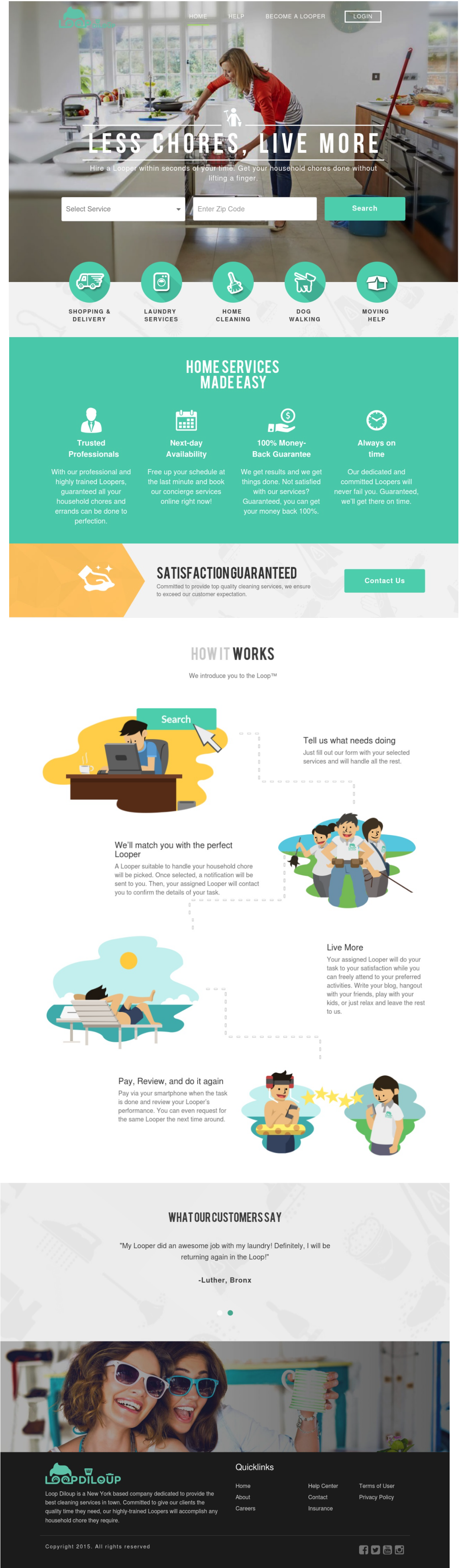
Loop di Loup
Overview
Loop Diloup sends out avid Loopers to clean your homes and do your errands so you can Do less and Live More. Vividly showcased on their website is a design that screams reliability, quality, and fast service. We gave their site a touch of personality too, with our skills in character design, the overall layout of the site becomes inviting.
Scope of work
- Character Design
- Copywriting
- Website
Project
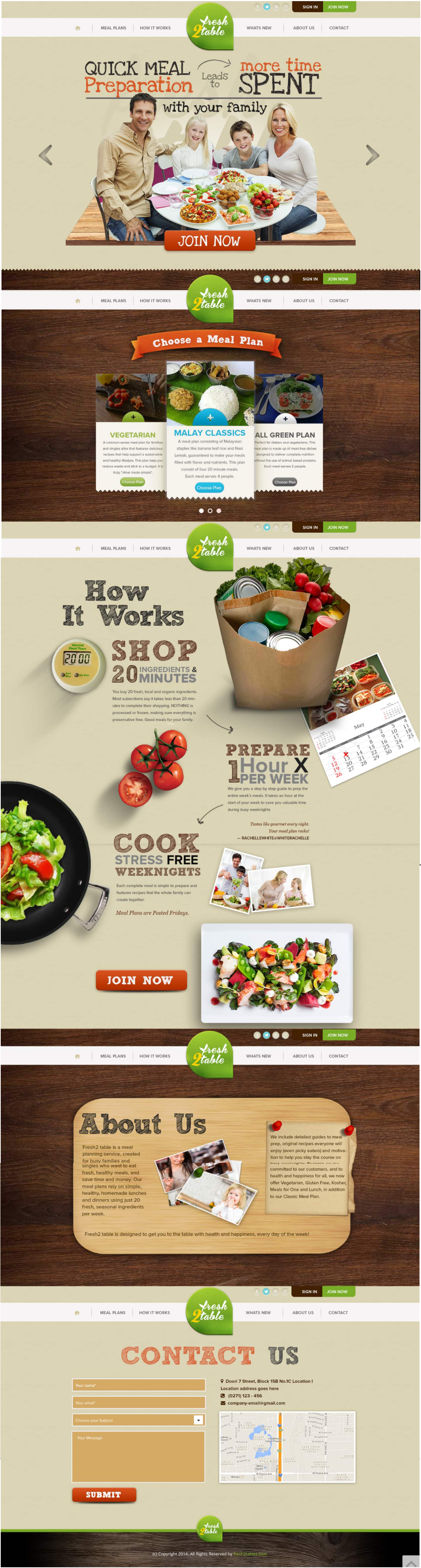
Fresh2Tables
Overview
Fresh Meal for the family. We Heroes love food - no, we worship food. Food gives us power, food makes us healthy - but this is not about food, is it? It's about this “fresh” looking website. We made one that will set the bar for a clean and crisp website. BTW, this reminds you of family Sundays, doesn't it?
Scope of work
- Character Design
Project
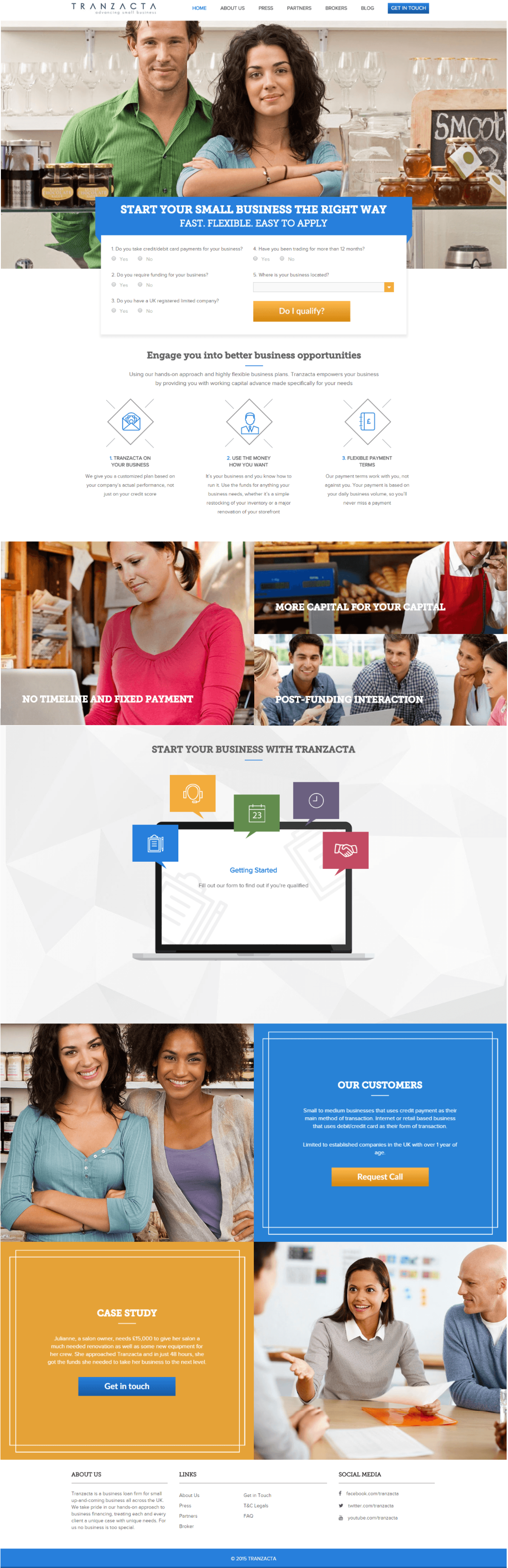
Tranzacta
Overview
SMEs across the UK turn to Tranzacta to give them the financial push they need to make the next big step in their ventures’ lifetime. We made them a website that showcases their sincerity and commitment to helping SMEs with back end features that allow them to service their clients anytime.
Scope of work
- Website
Project
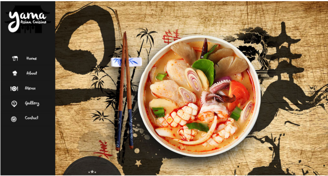
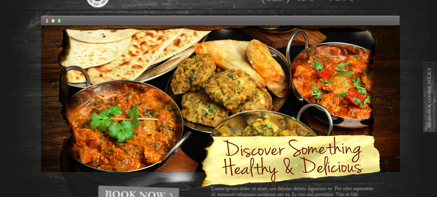
Yama Asian Cuisine
Overview
Who doesn't love food? I don't think I know a single hero who doesn't. So go and treat yourself by visiting Yama's mouth watering website and savor all its dishes in HD. We decided to go for an oriental theme that would perfectly suit Yama's Asian cuisine, complete with high quality photos of popular courses from all over Asia. If you're such a gastronome like us, then Yama is just for you!
Scope of work
- Website
Project
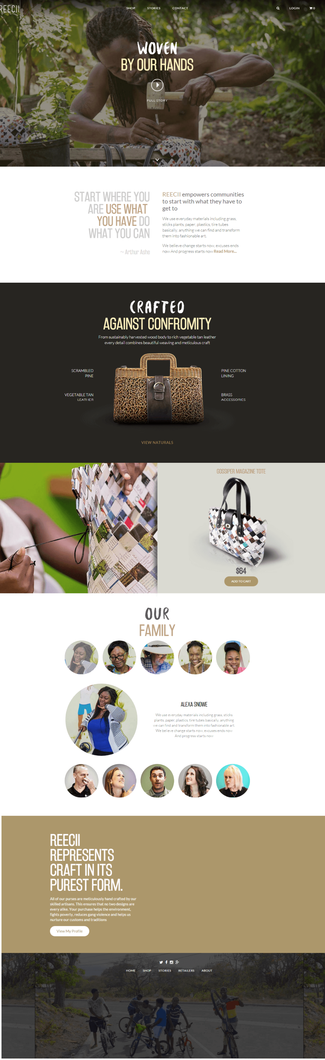
Reecii
Overview
Reecii makes fashionable bags from everyday materials by hand. This craft is truly amazing. That's why they deserve a website that fits them well. In designing their website, we opted to make it clean and natural. With the use of neutral colors, blended with high quality images, infused with great typography, we've achieved a clean and stylish design, perfect for this earth-friendly and meticulous craft.
Scope of work
- Website
Project
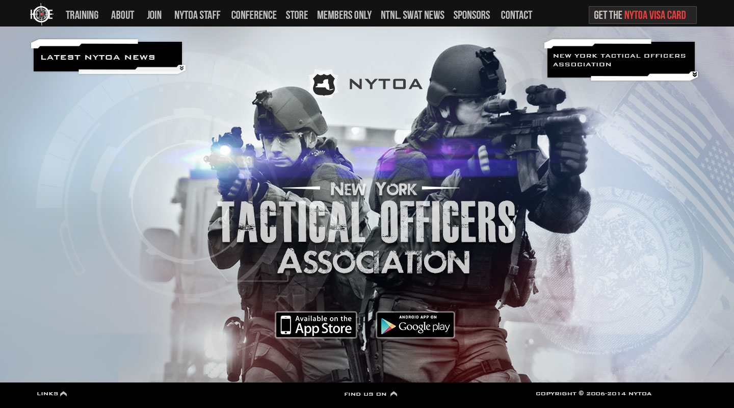
NYTOA
Overview
The New York Tactical Officers Association is a non-profit corporation established to promote training, professionalism, and the exchange of information between members of law enforcement, tactical units, and crisis negotiation teams.
Designing NYTOA is a real treat for us. Why? Because they work for the good of humanity and so do we. We're both heroes in this regard - and heroes help each other.
Scope of work
- Character Design
- Copywriting
- Website
Project
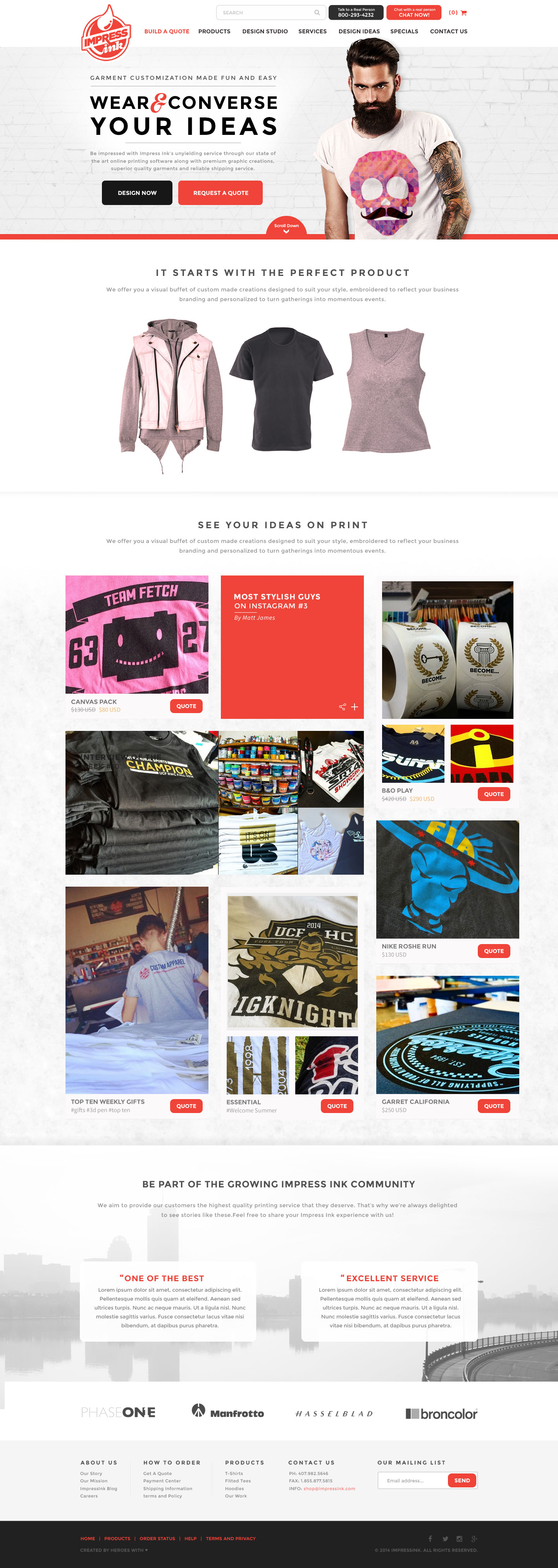
Impress Ink
Overview
You are what you wear. Someone said that you shouldn't judge a person by what he wears. Yeah? Okay have you ever been questioned about the design on the shirt you're wearing? You get the idea. Impress Ink is a printing service that lets you show who you really are! Look at their new website! Isn't it just amazing?
Scope of work
- Website
Project
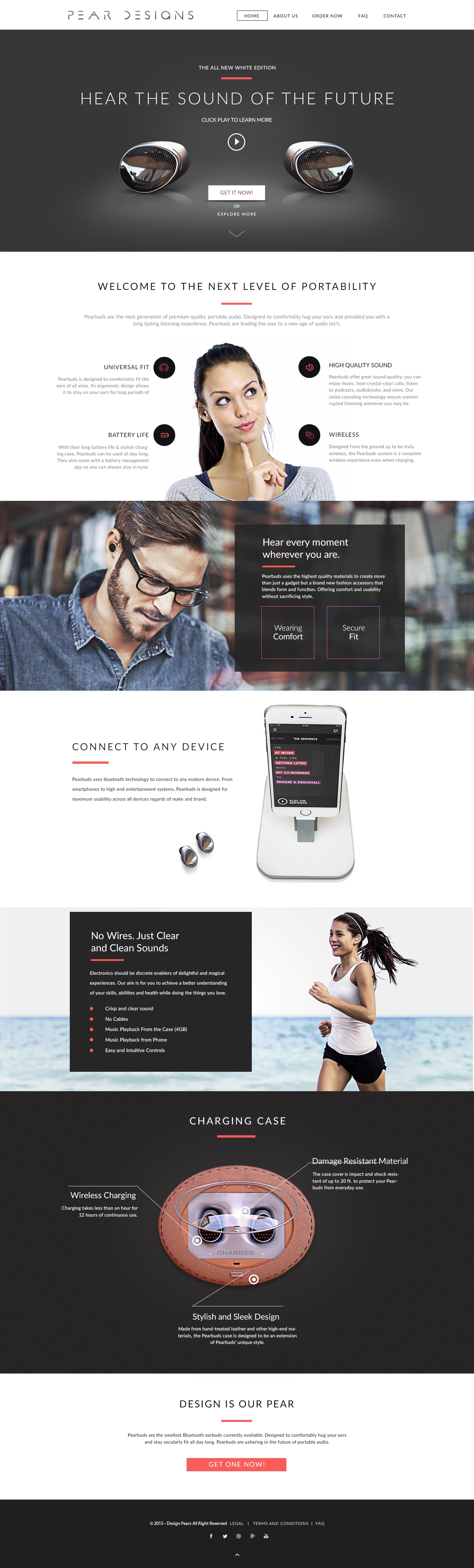
Pear Designs
Overview
Pear Designs is a team of innovators and creatives pushing towards the next step in consumer technology: complete wirelessness. Their wireless earphones is a testament to their ingenuity and innovations in consumer electronics; blending form and function into a synchronized whole. The website we made for them is no different showcasing everything that makes them special without losing its elegance.
Scope of work
- Website
Project
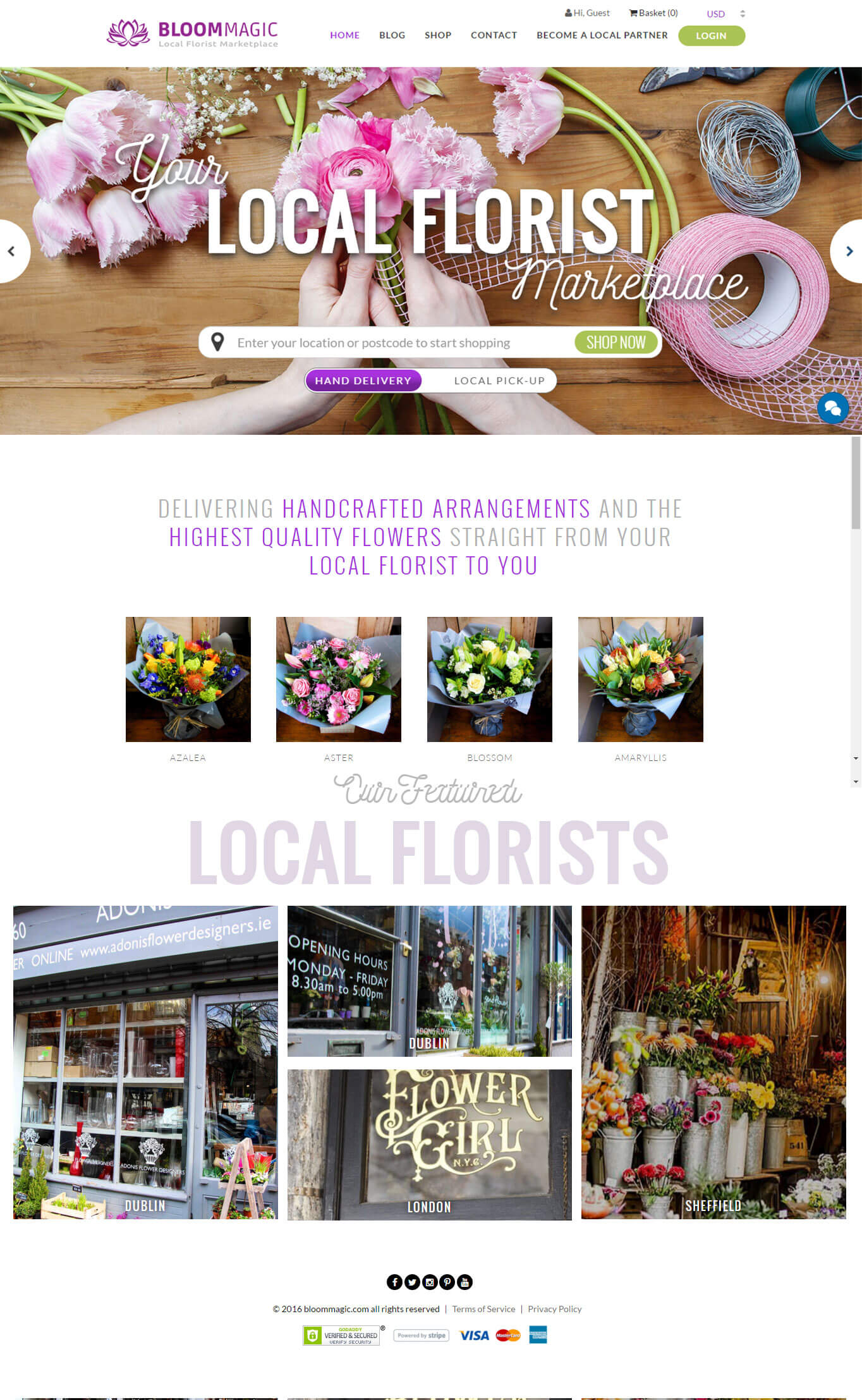
Bloom Magic
Overview
“Roses are red. Violets are blue” Bask in these fine, exquisite selection of hues. Bloom Magic presents a variety of flowers, radiating elegant hues arranged charmingly. The site emanates radiance and elegance with its simple white spaces, each flower arrangement gets highlighted gorgeously.
Scope of work
- Website
Project
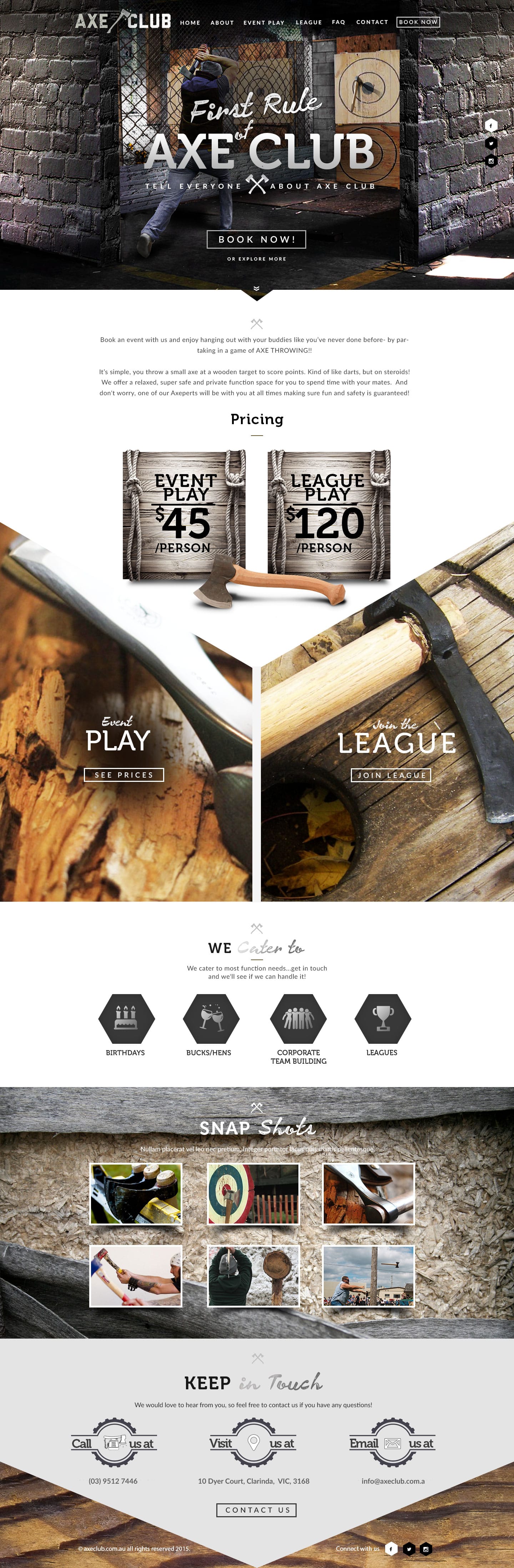
Axe Club
Overview
Axe throwing was once the greatest display of both strength and finesse of any individual throughout many different cultures in history. Axe Club is here to bring back this sport to the modern world. And what better way to do it than a website that highlights the fun and excitement axe throwing can bring to any gathering or celebration. So tell your friends cause the first rule of Axe Club is to always talk about Axe Club.
Scope of work
- Copywriting
- Website
Project
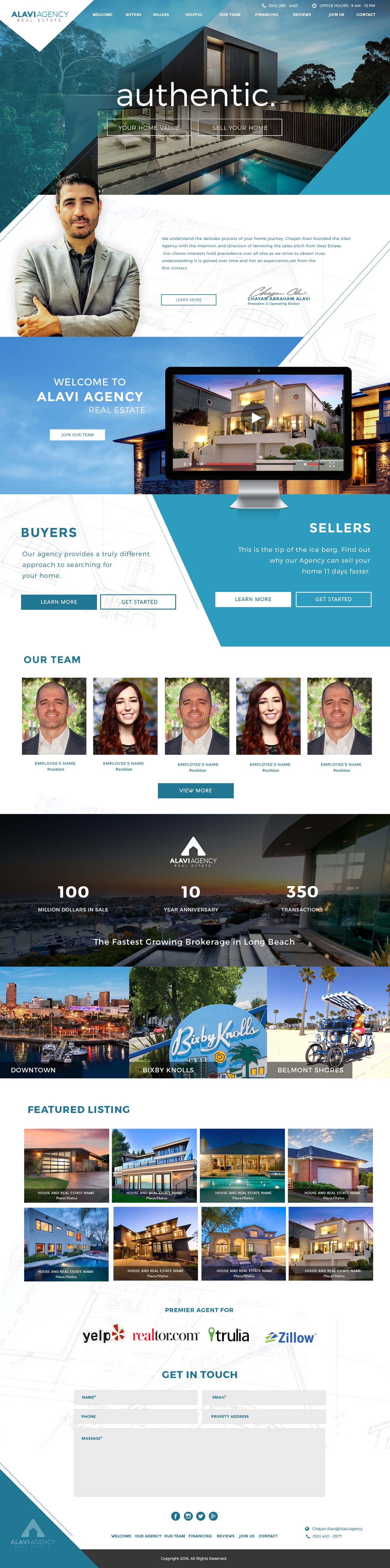
Alavi Agency
Overview
Crisp and modern. Tha's how we designed Alavi Agenc's website. The high-quality photos of real estates and the fresh blue color all blended well to give them an exceptional website. Yep, our design heroes thought of artistically blending all that.
Scope of work
- Website
Project
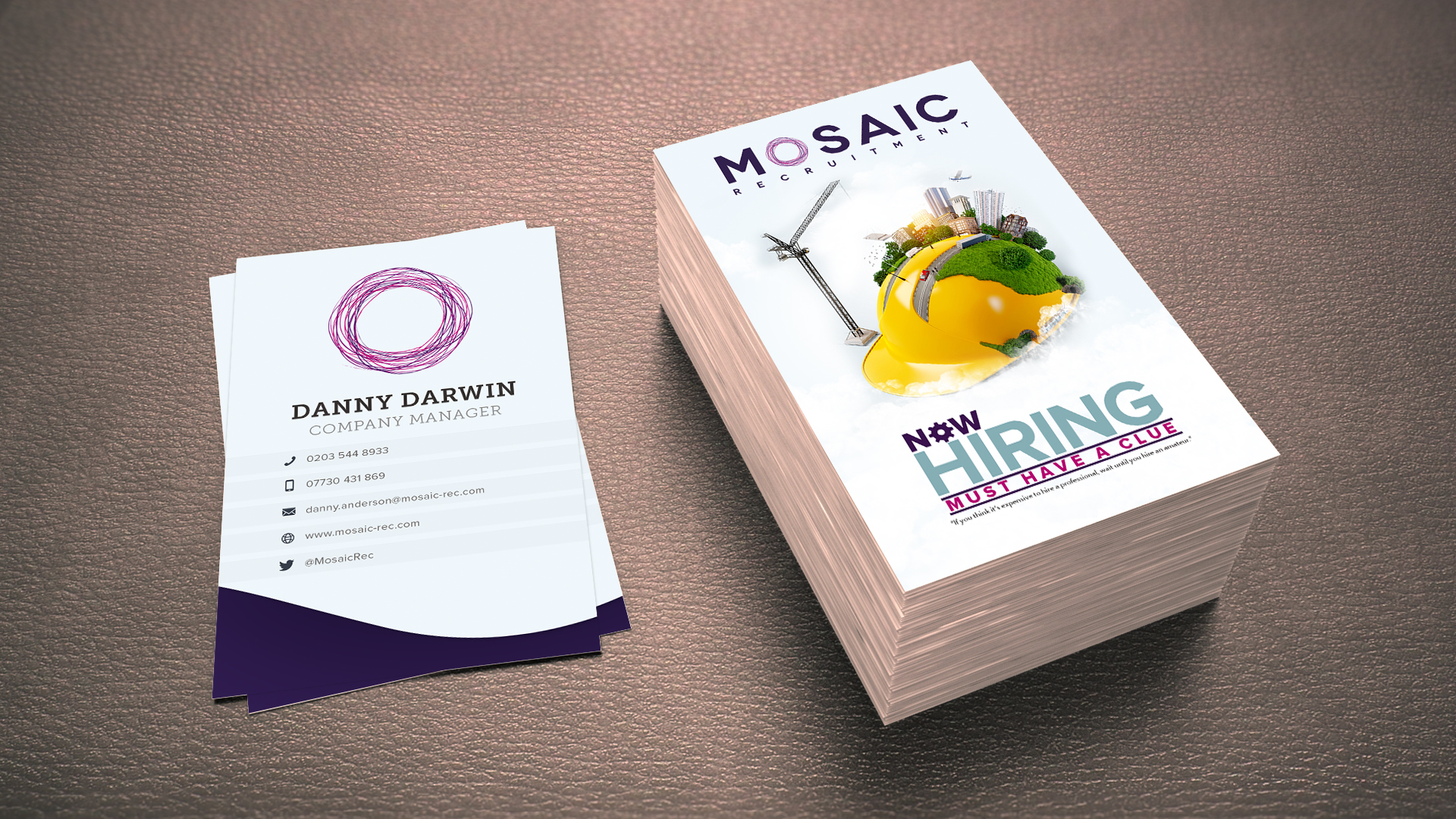
Mosaic Recruitment-Brochure
Overview
Employing a clean, white, glossy background, the central design of the brochure is accentuated through simple images combined perfectly altogether. Radiating purple hue mixed with a bright yellow, the overall effect becomes highly engaging. Simple yet interactive, the design screams attention.
CLIENT
- Danny Darwin
Scope of work
- Graphics & Print
.jpg)
Project
Short Let Saints - Corporate Identity
Overview
Through the power of sleek blue and a clean white hue, Short let Saints' corporate identity becomes stunningly effective. A clean and refreshing branding image, the overall company image speaks volume about calmness and tranquility.
CLIENT
- Rory Smith
Scope of work
- Graphics & Print
.jpg)
Project
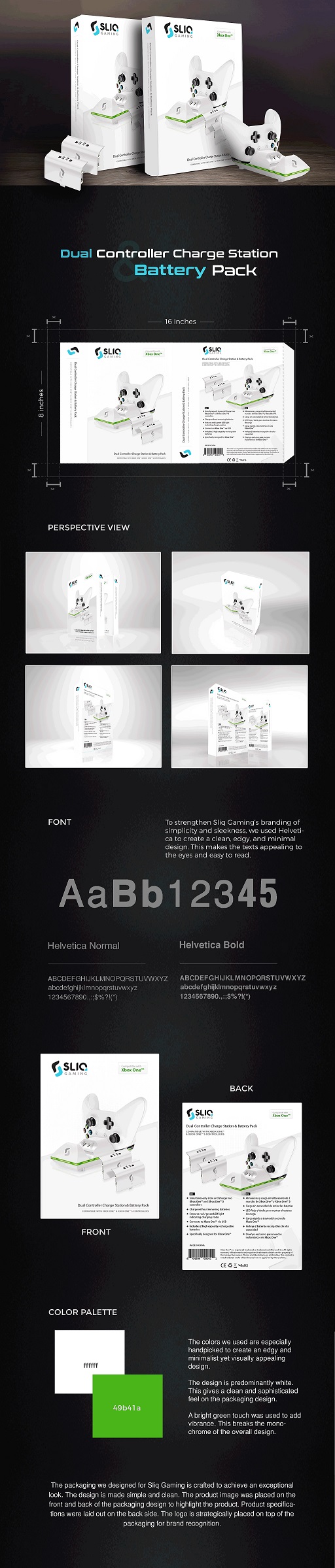
Sliq Gaming - Storage Case Sleeve
Overview
For Sliq Gaming's storage case sleeve, we opted for a simple, minimalist approach to let the images and content stand out. The dominance of the black color added to the sophistication of this design.
Project
Sliq Gaming - Xbox One Packaging
Overview
When we designed Sliq Gaming's Xbox One packaging, we thought to make it neat and simple. With the product as the focal point of the design, who wouldn't feel the excitement of opening this package?
Project
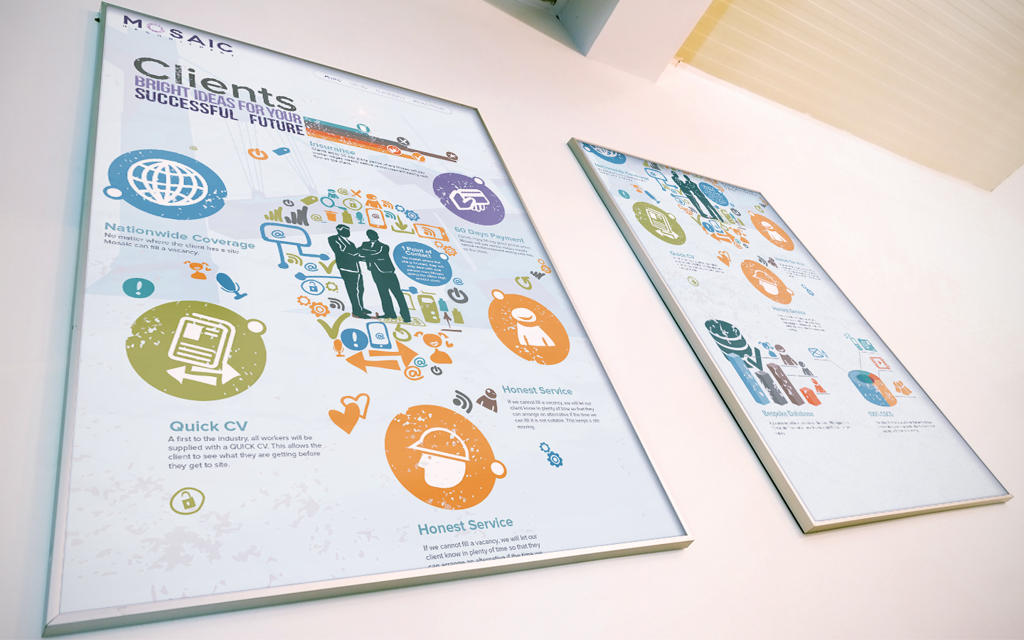
Mosaic - Infographics
Overview
Mosaic is a recruitment agency for the construction industry, supplying trade and labor to hundreds of companies world. They needed an infographic design that they can put inside their office for everybody to read. We answered by creating a vectorized infographic that is both engaging and easy on the eyes.
Scope of work
- Graphics & Print
Project
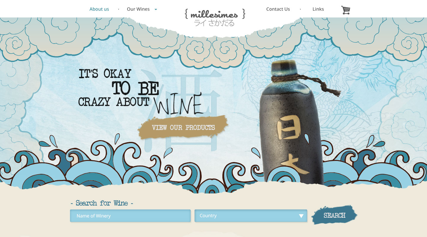
Mille Simes
Overview
Is it wine o'clock yet? One try of wine from Millesimes and you'll find yourself gobbling bottle after bottle of their delicious wines. Our take on Millesimes website is to create a fresh and inviting website where wine drinkers and enthusiasts can go for a refreshing wine experience.
Scope of work
- Design Only

Project
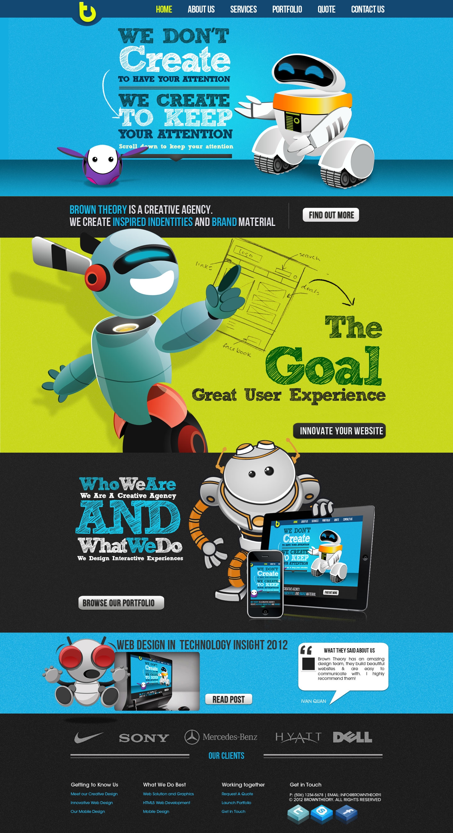
Fish4ADeal Explainer Video
Project
Overview
Scope of work
Project
Overview
Scope of work
Project
Overview
Scope of work
Project
Overview
Scope of work
Project
Overview
Scope of work
Project
Overview
Scope of work
Project
Overview
Scope of work
Project
Overview
Scope of work
Project
Overview
Scope of work
Project
Overview
Scope of work
Project
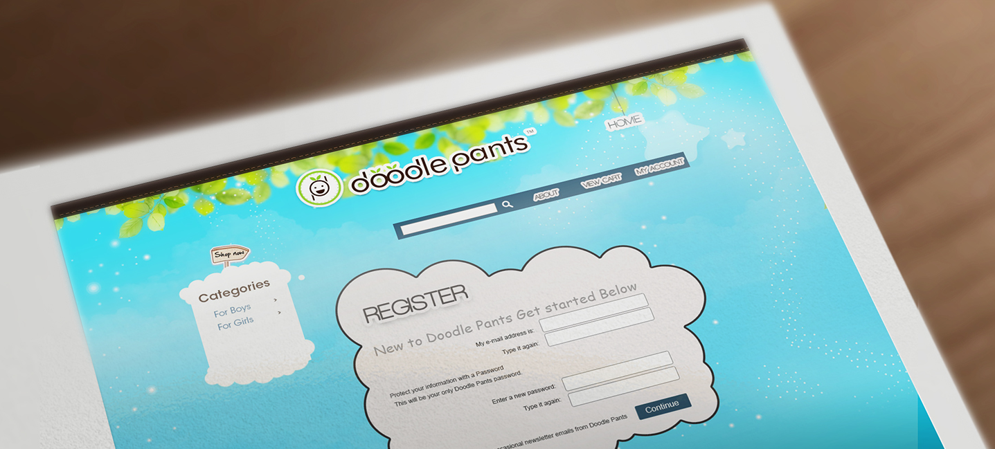
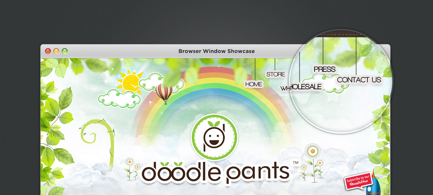
Doodle Pants
Overview
Scope of work
Project
Overview
Scope of work
Project
Overview
Scope of work
Project
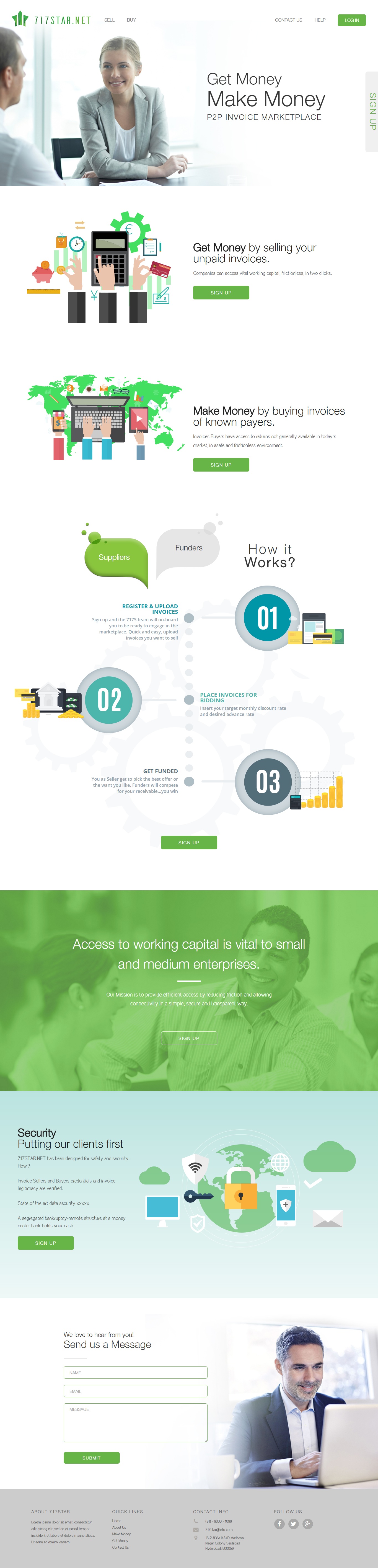
717 Star.Net
Overview
Scope of work
Project
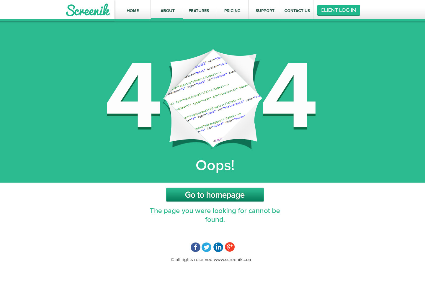
Screenik
Overview
Scope of work
Project
Afiesta
Overview
Scope of work
.png)
Project
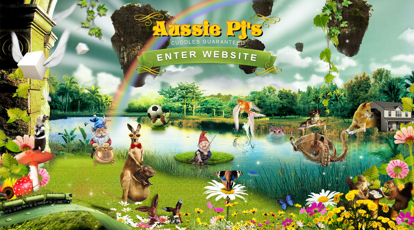
aussie pj's
Overview
Scope of work
Project
Overview
Scope of work
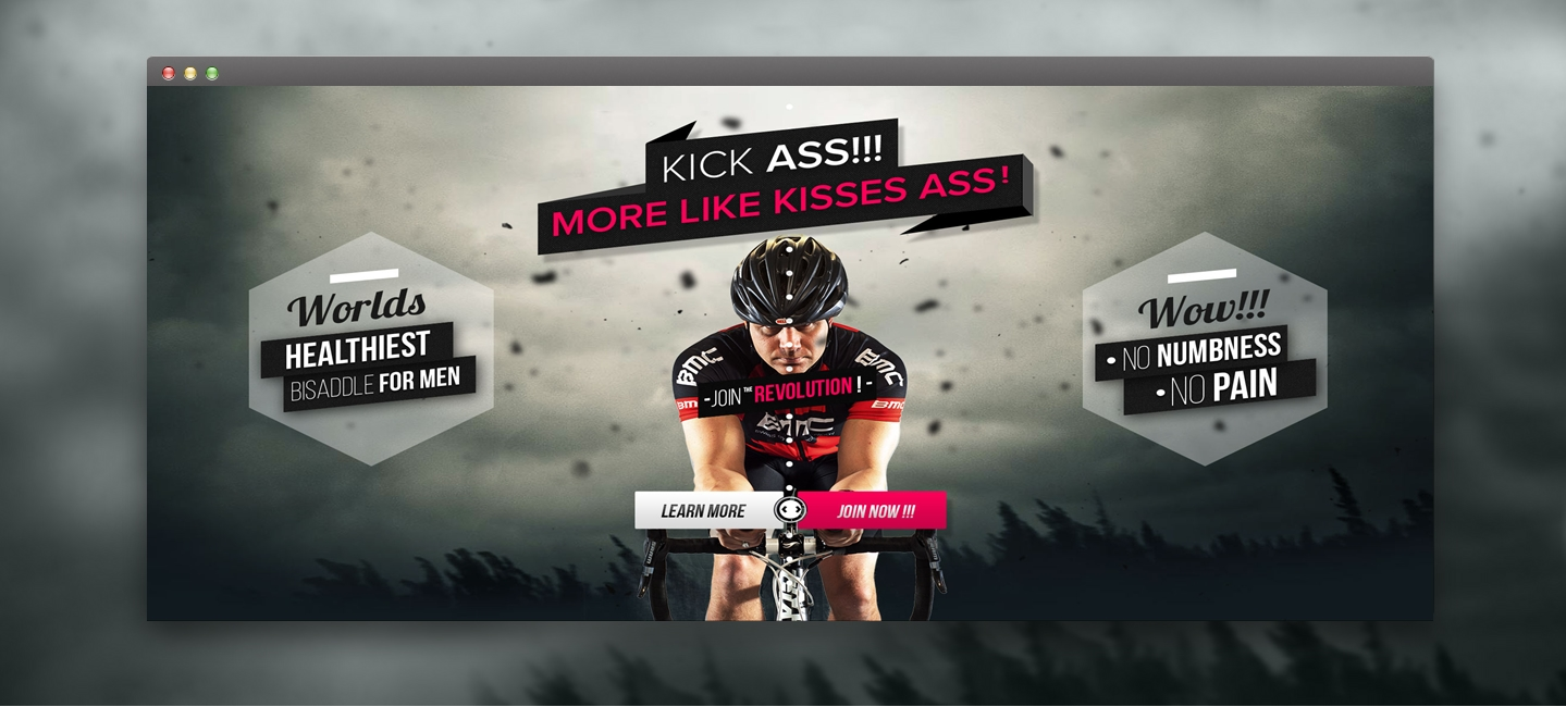
Project
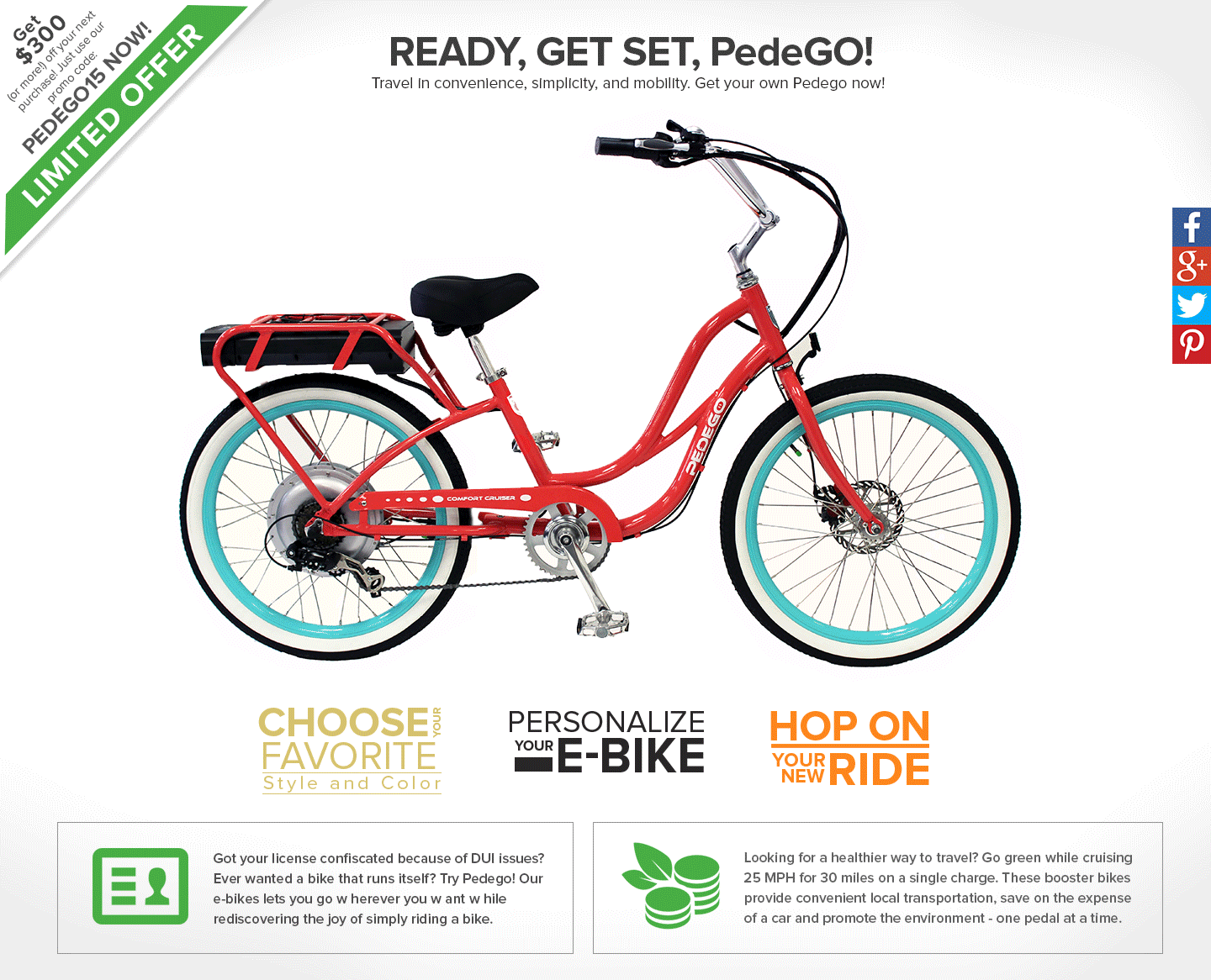
Boca Bike
Overview
Scope of work
Project
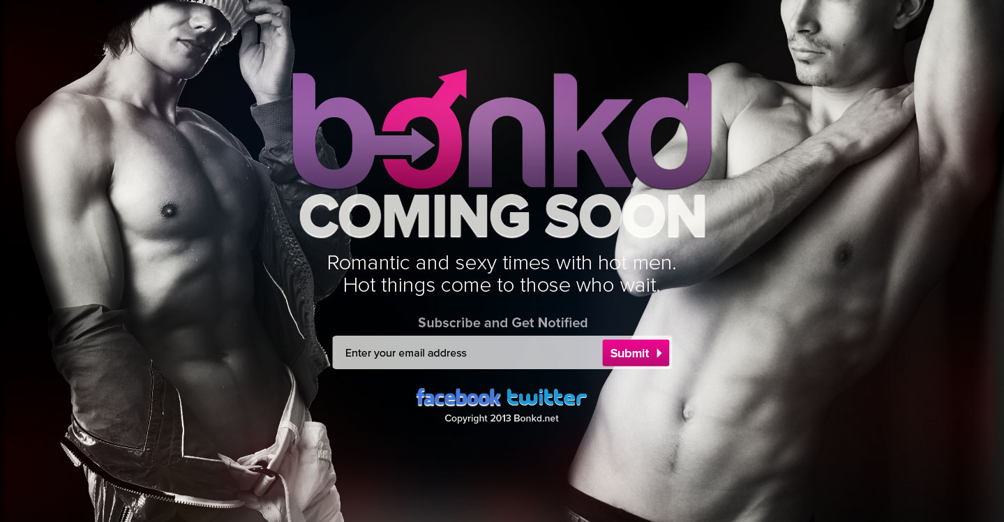
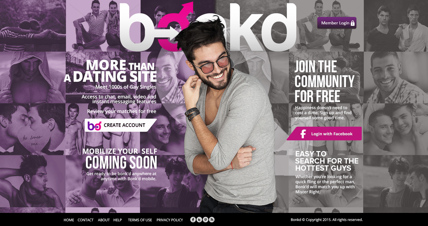
Bonkd
Overview
Scope of work
Project
Overview
Scope of work
Project
Overview
Scope of work
Project
Overview
Scope of work
Project
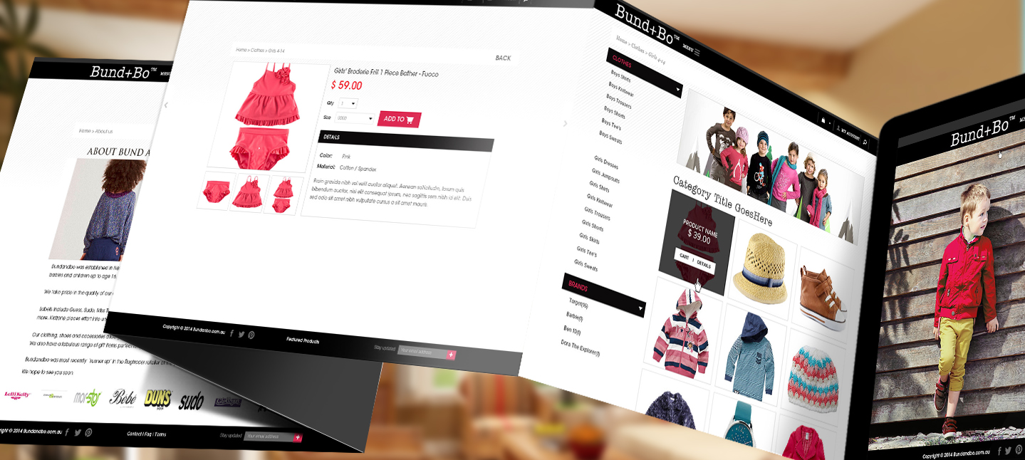
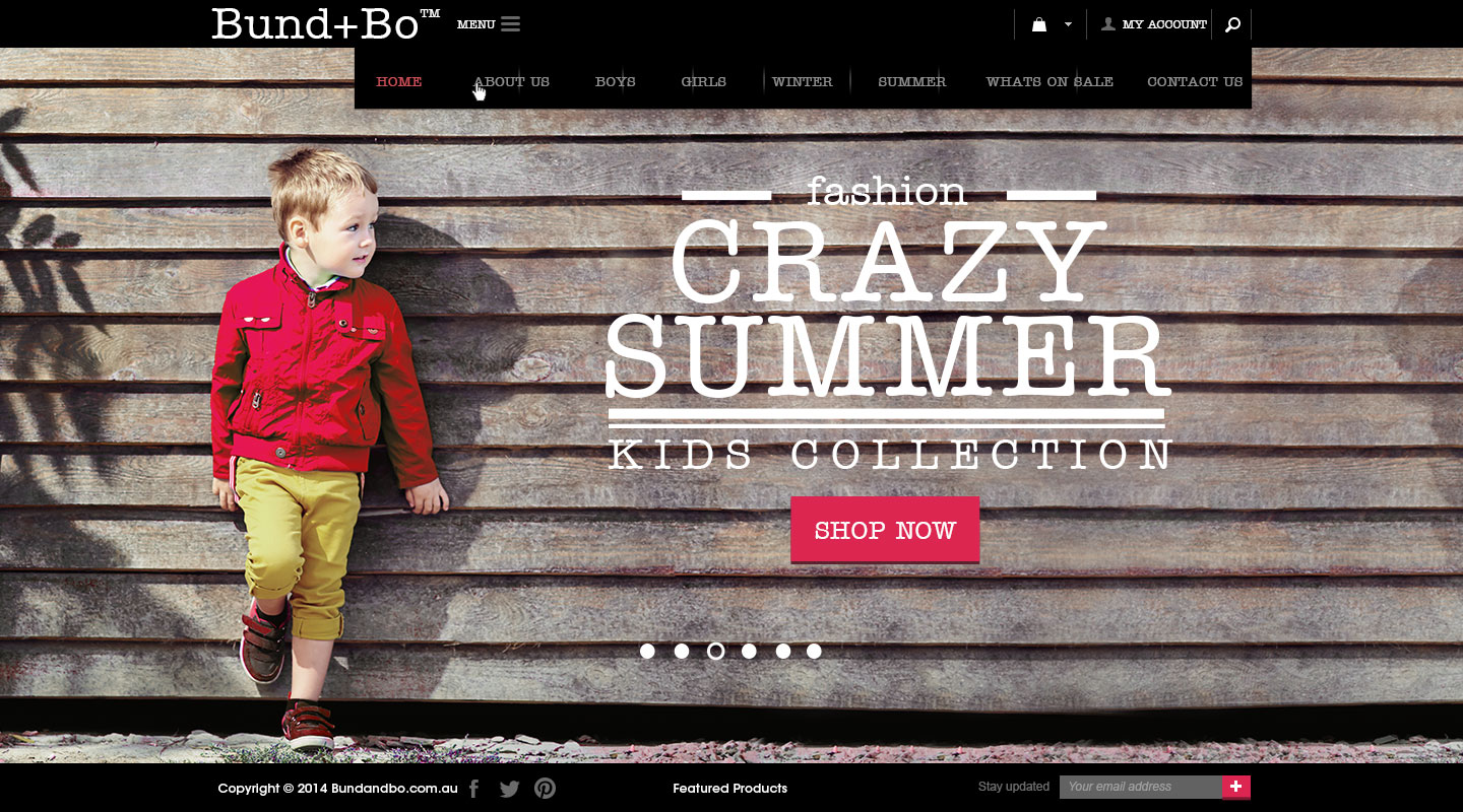
Bund + Bo
Overview
Scope of work
Project
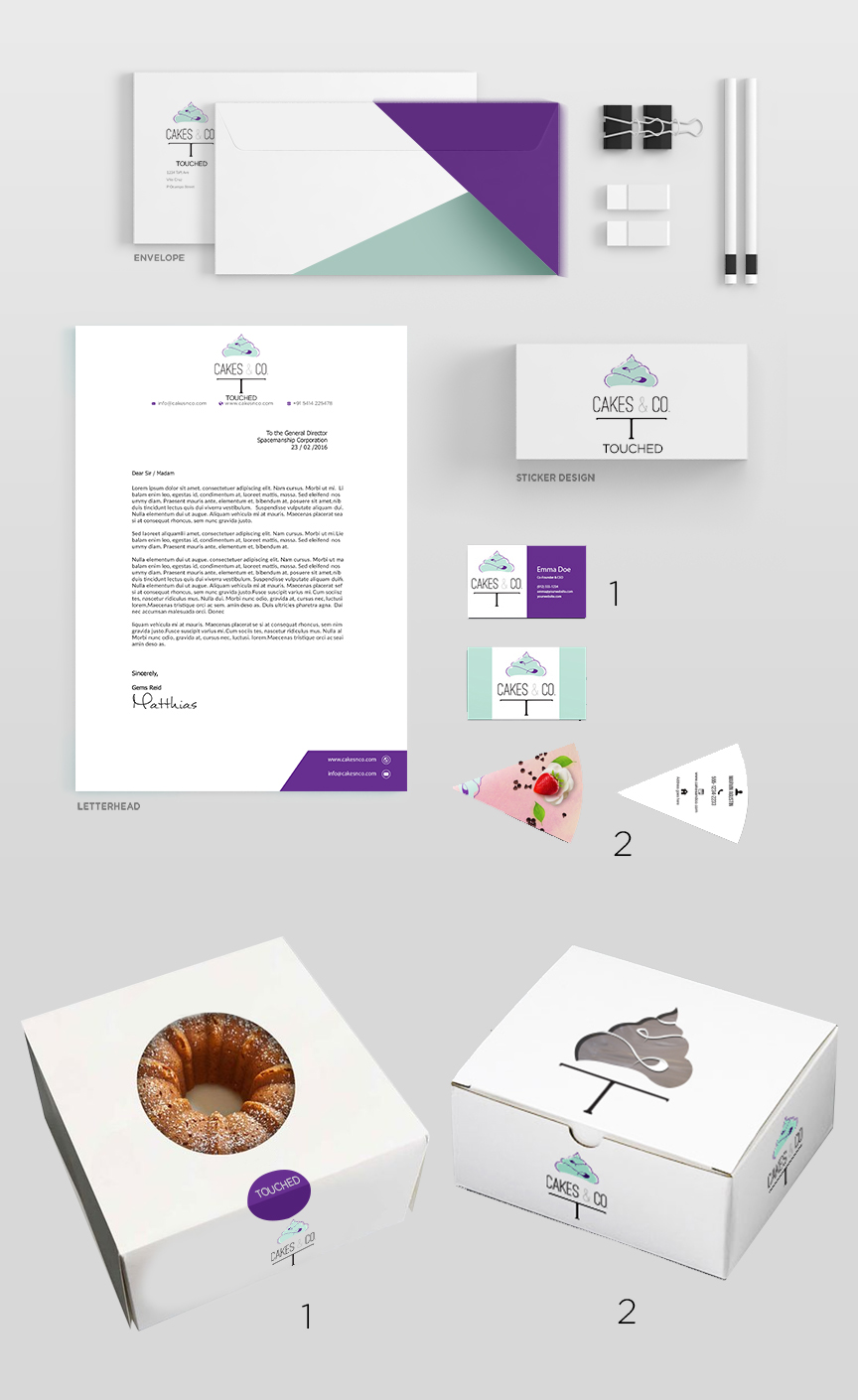
Cakes and Co
Overview
Scope of work
Project
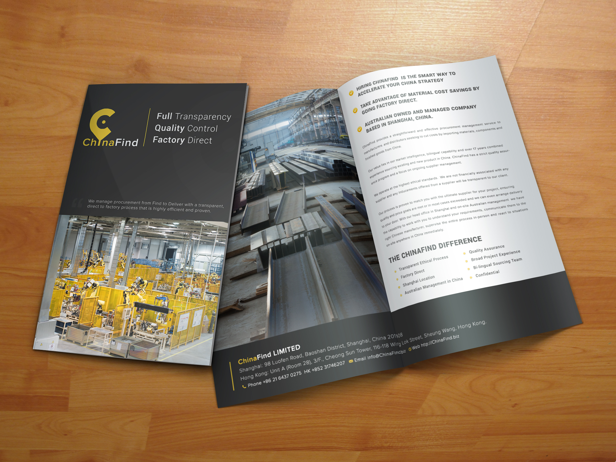
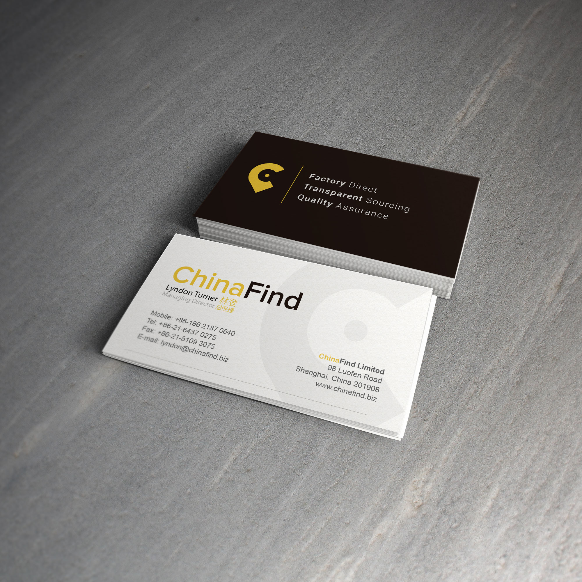
China Find Business Card
Overview
Scope of work
Project
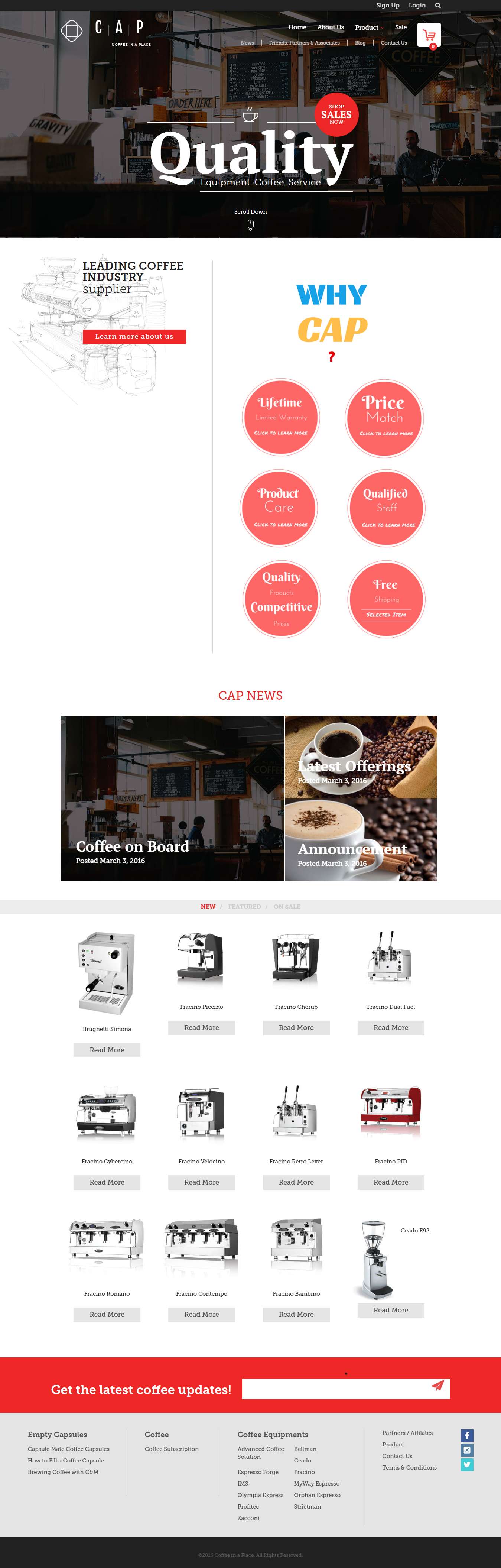
Coffee in a place
Overview
Scope of work

Project
Commun-e
Overview
Scope of work
Project
Commun-e
Overview
Scope of work
Project
Overview
Scope of work
Project
Overview
Scope of work
.jpg)
Project
Dynamix IT
Overview
Scope of work
Project
Eglington Dog Walker
Overview
Scope of work
Project
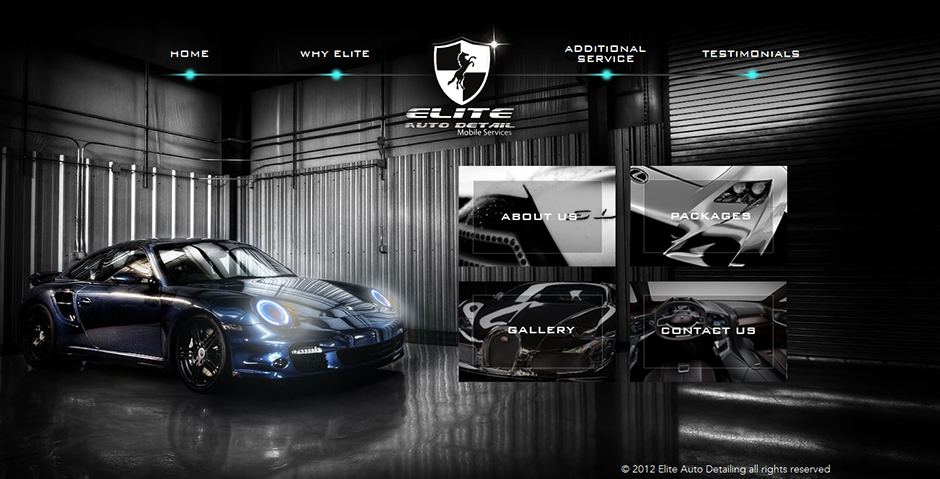
Elite Autodeal
Overview
Scope of work
Project
Overview
Scope of work
Project
Overview
Scope of work
Project
Favicon Sand Sanctuary
Overview
Scope of work
Project
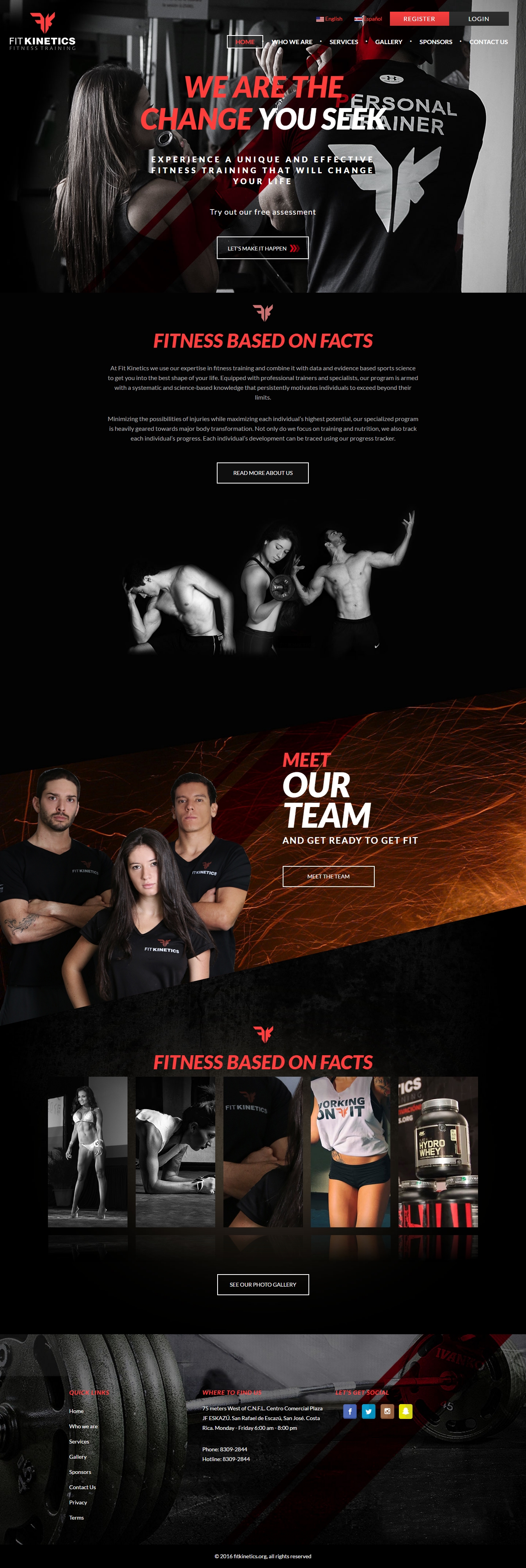
Fit Kinetics
Overview
Scope of work
Project
Gas Town
Overview
Scope of work
Project
Gavsh Media
Overview
Scope of work
Project
Overview
Scope of work
Project
Geaux Logo
Overview
Scope of work
Project
Genesis Ultraslim
Overview
Scope of work
Project
Overview
Scope of work
Project
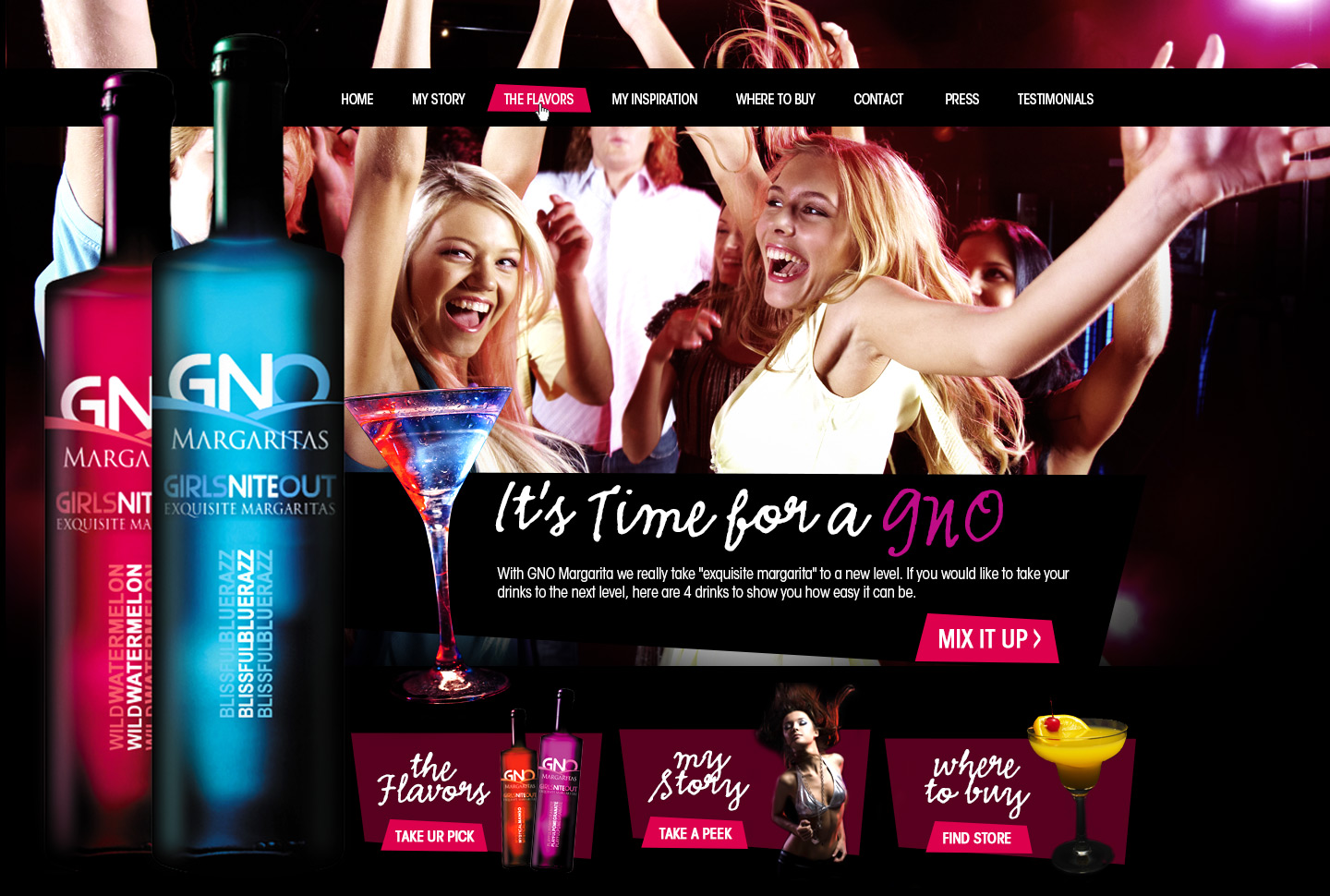
GNO margaritas
Overview
Scope of work
Project
Overview
Scope of work
Project
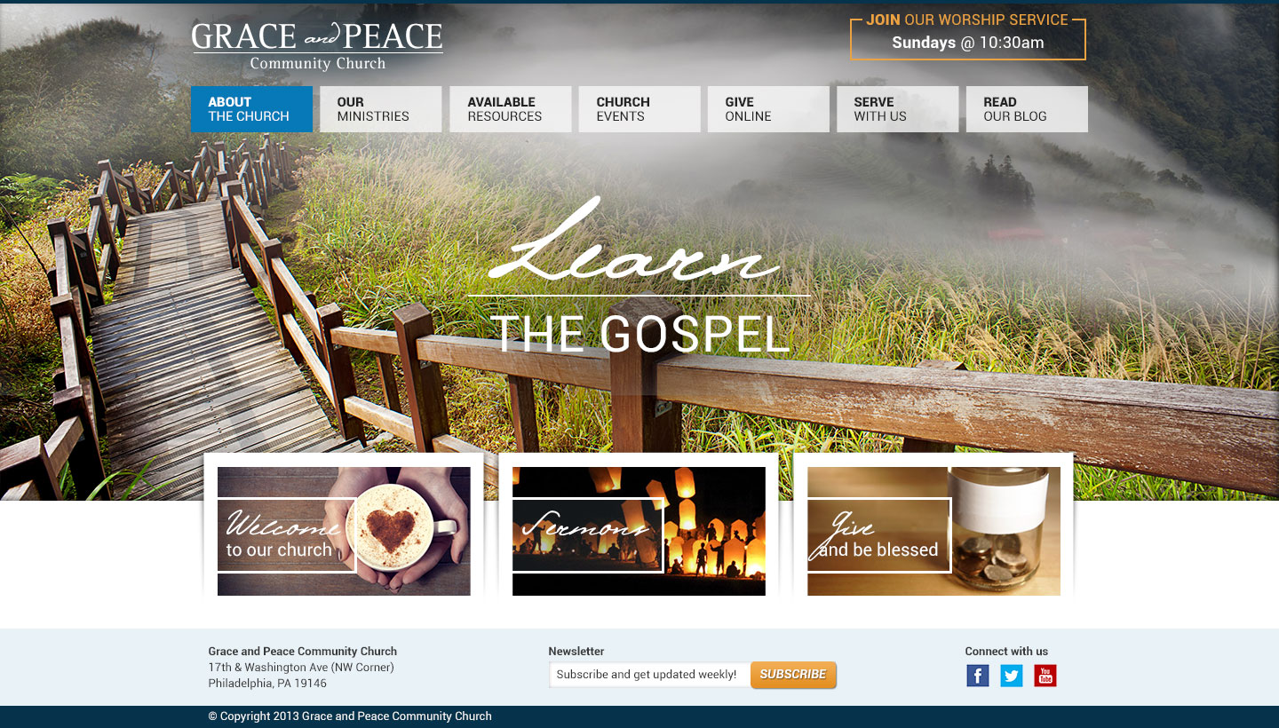
Grace and Peace
Overview
Scope of work

Project
happy Moms Custom Photography
Overview
Scope of work

Project
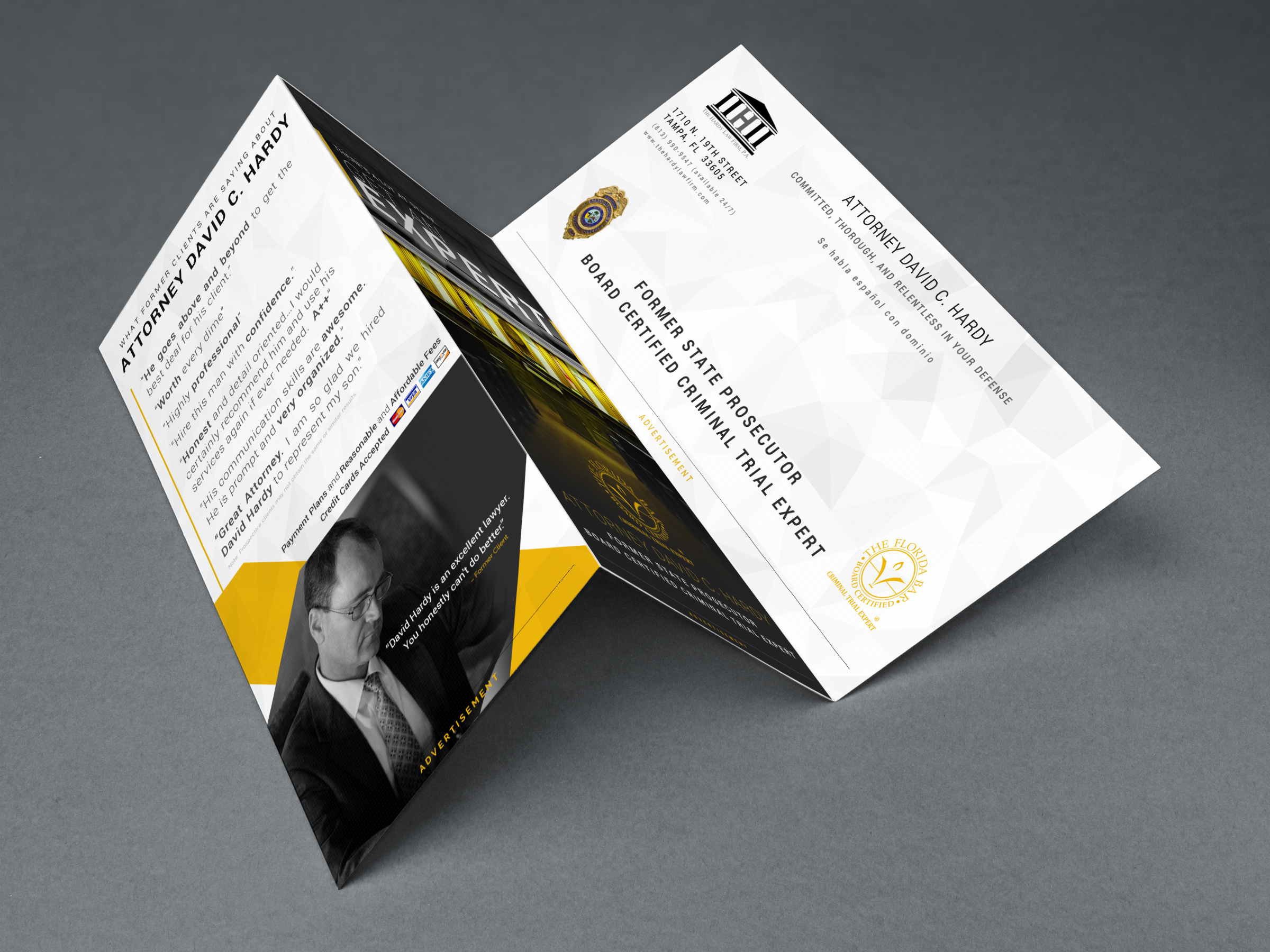
Hardy Law
Overview
Scope of work
Project
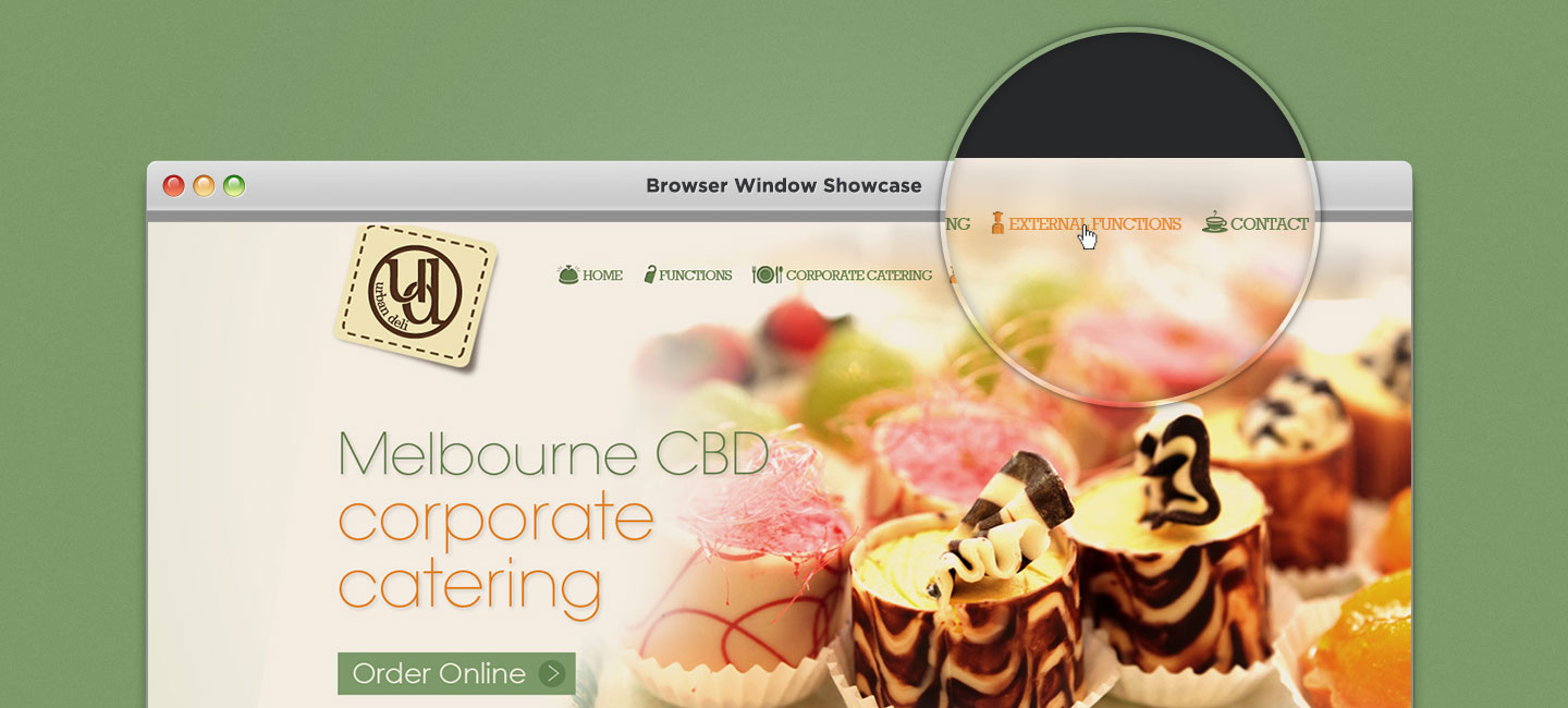
Urban Deli
Overview
Scope of work
Project
Parker Gwen
Overview
Scope of work
Project
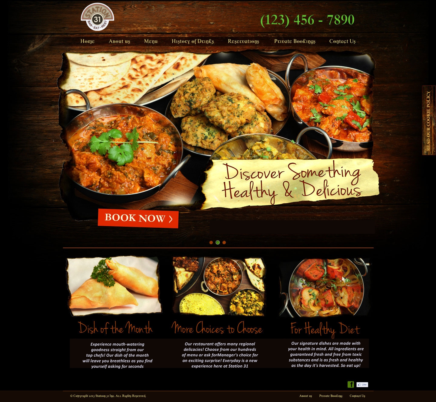
Station 31
Overview
Scope of work
.jpg)
Project
Honey Bee Menu
Overview
Scope of work

Project
Indiespiral
Overview
Scope of work
Project
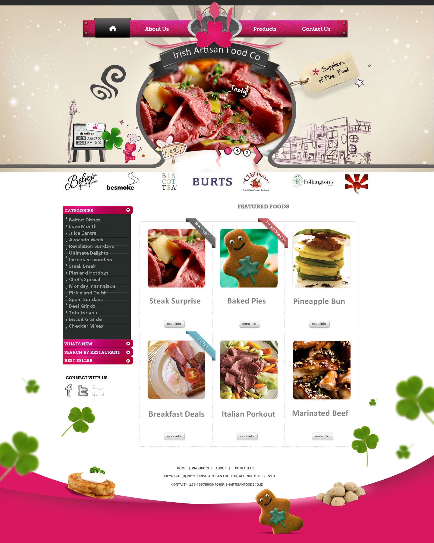
Irish Artisan Food Co
Overview
Scope of work

Project
Jared and Patricia
Overview
Scope of work
Project
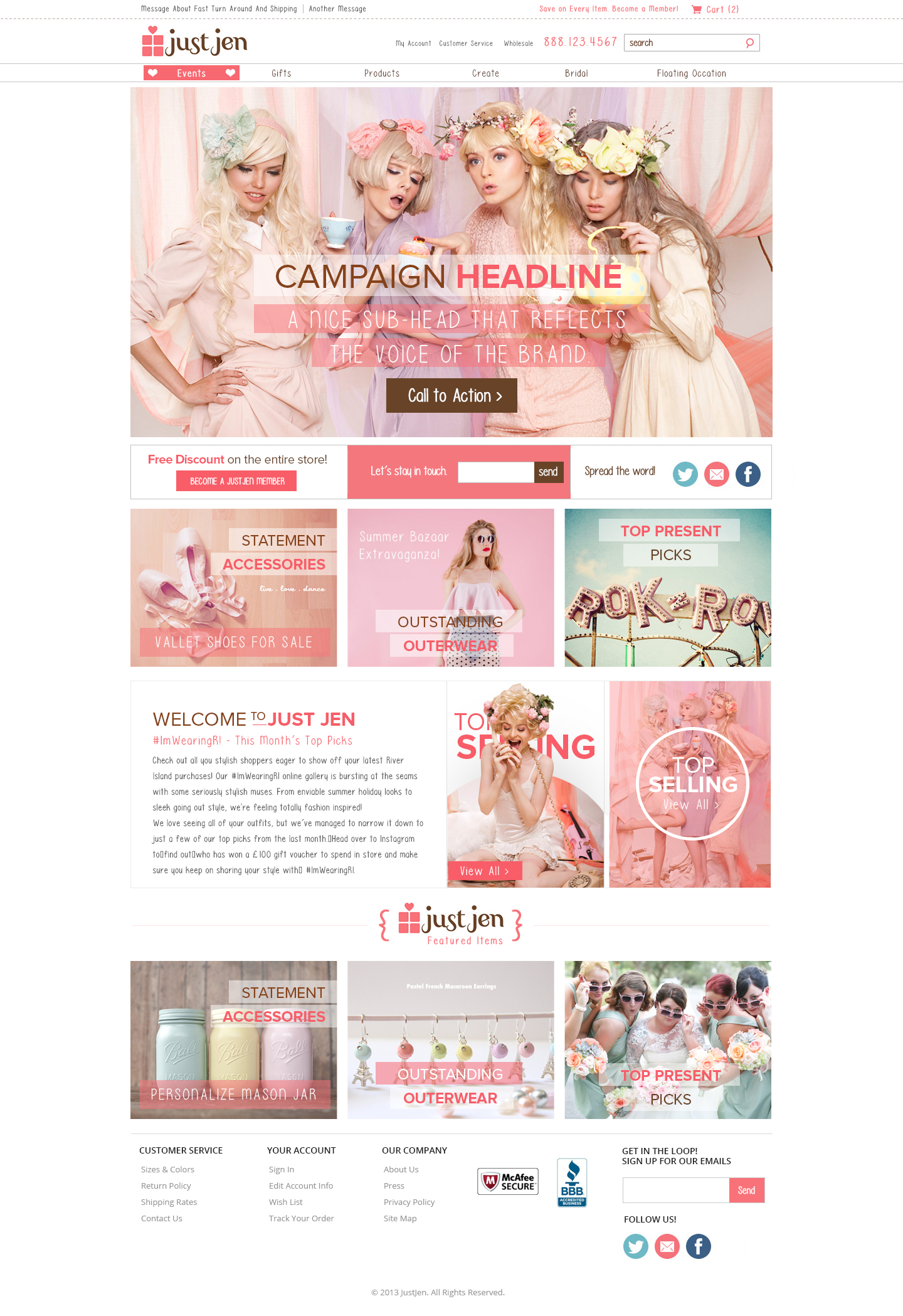
Just Jen
Overview
Scope of work

Project
Keller
Overview
Scope of work
Project
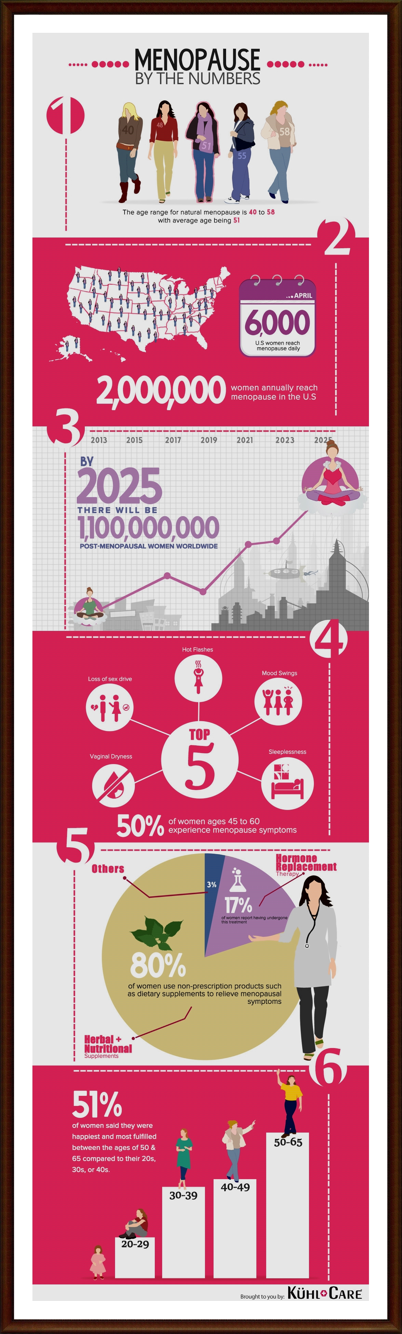
Kuhl Care Infographics
Overview
Scope of work
Project
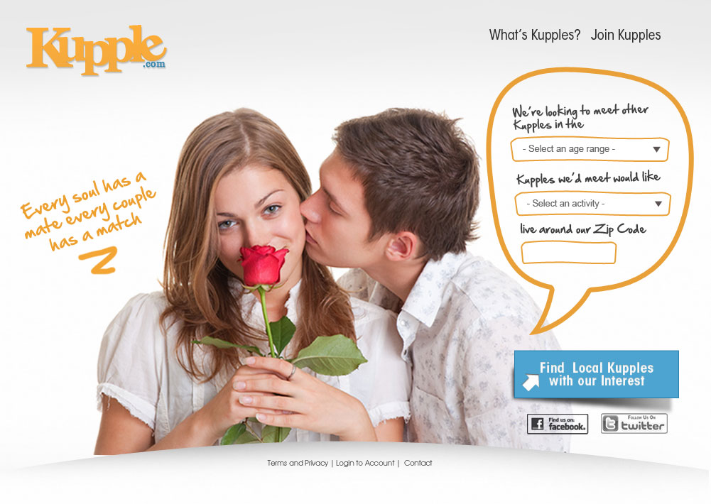
Kupple
Overview
Scope of work
Project
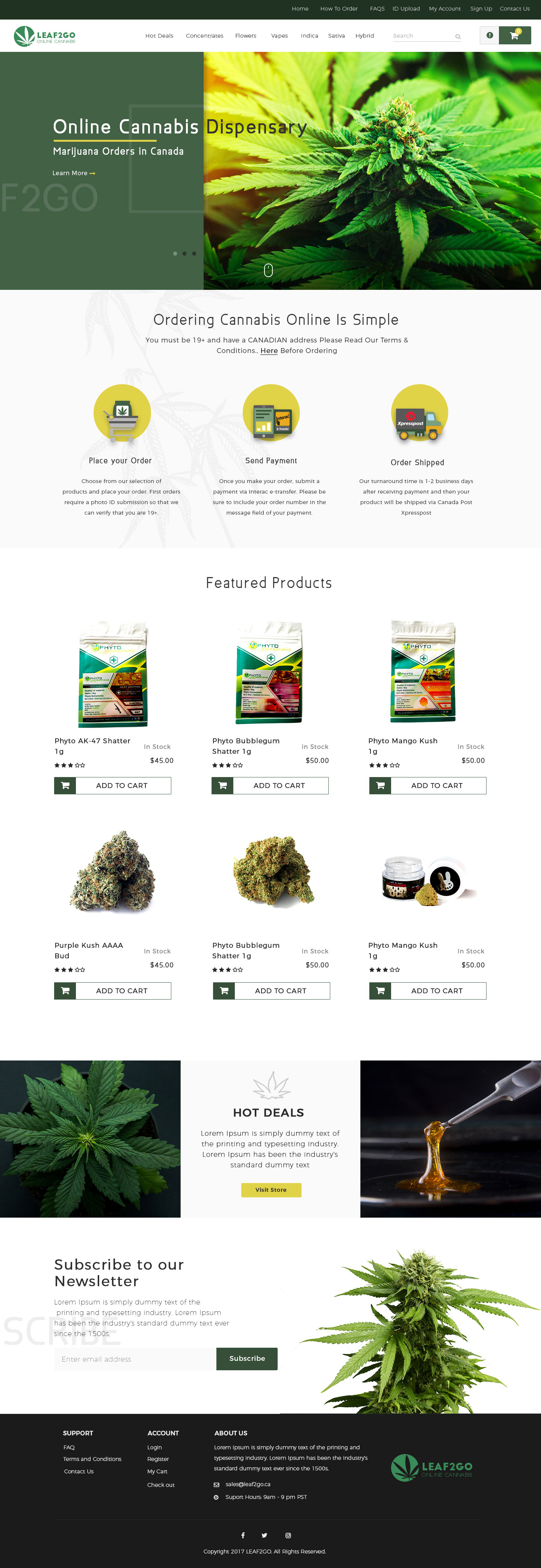
Leaf 2 Go
Overview
Scope of work
Project
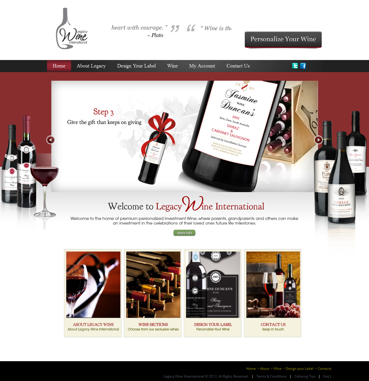
Legacy Wine International
Overview
Scope of work
Project
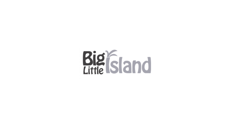
Little Big Island
Overview
Scope of work
Project
Overview
Scope of work
Project
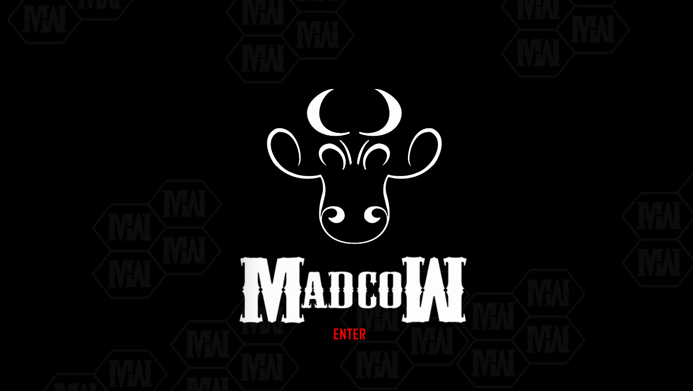
MadCow
Overview
Scope of work
Project
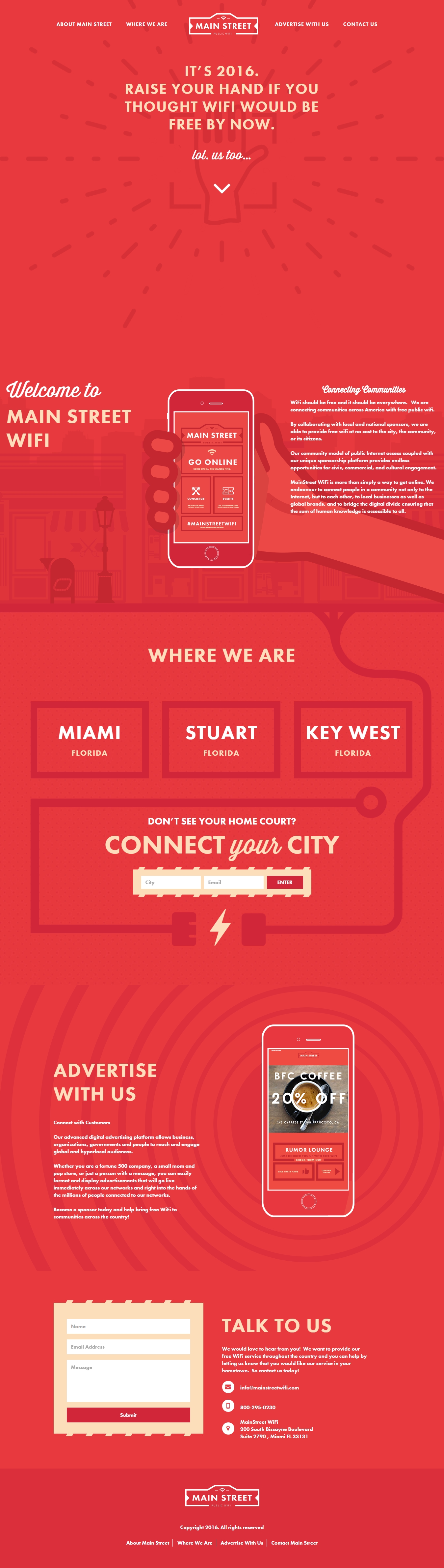
Main Street Wifi
Overview
Scope of work
Project
Maldives Exclusive
Overview
Scope of work
Project
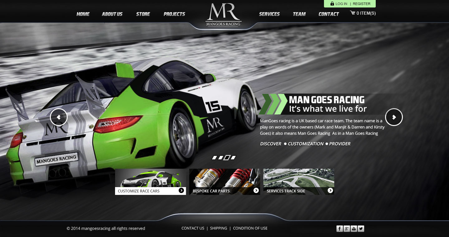
Man Goes Racing
Overview
Scope of work
Project
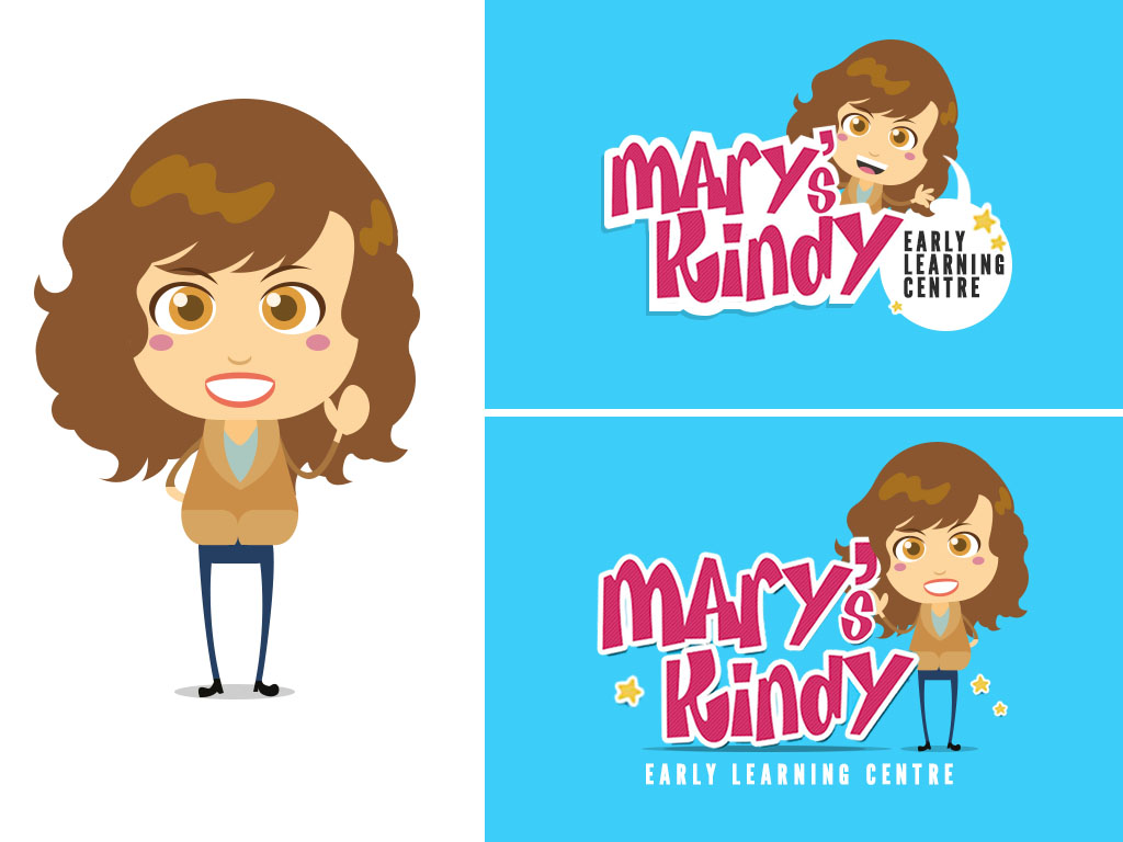
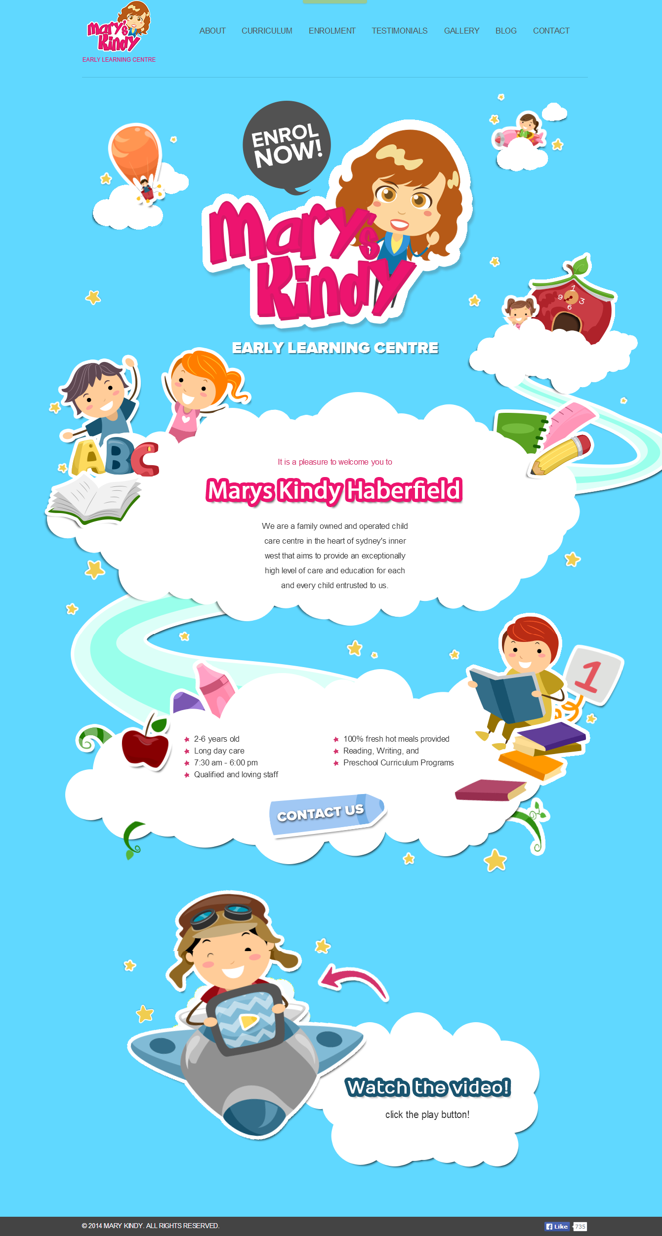
mary Kindly
Overview
Scope of work
Project
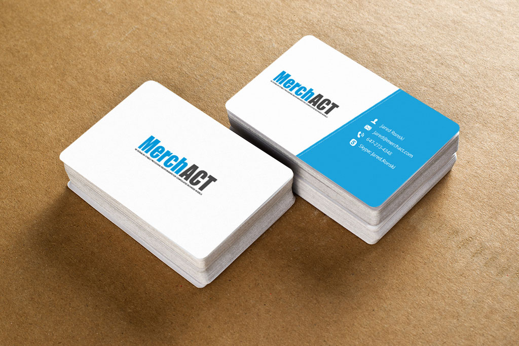
MerchAct
Overview
Scope of work
Project
Overview
Scope of work
Project
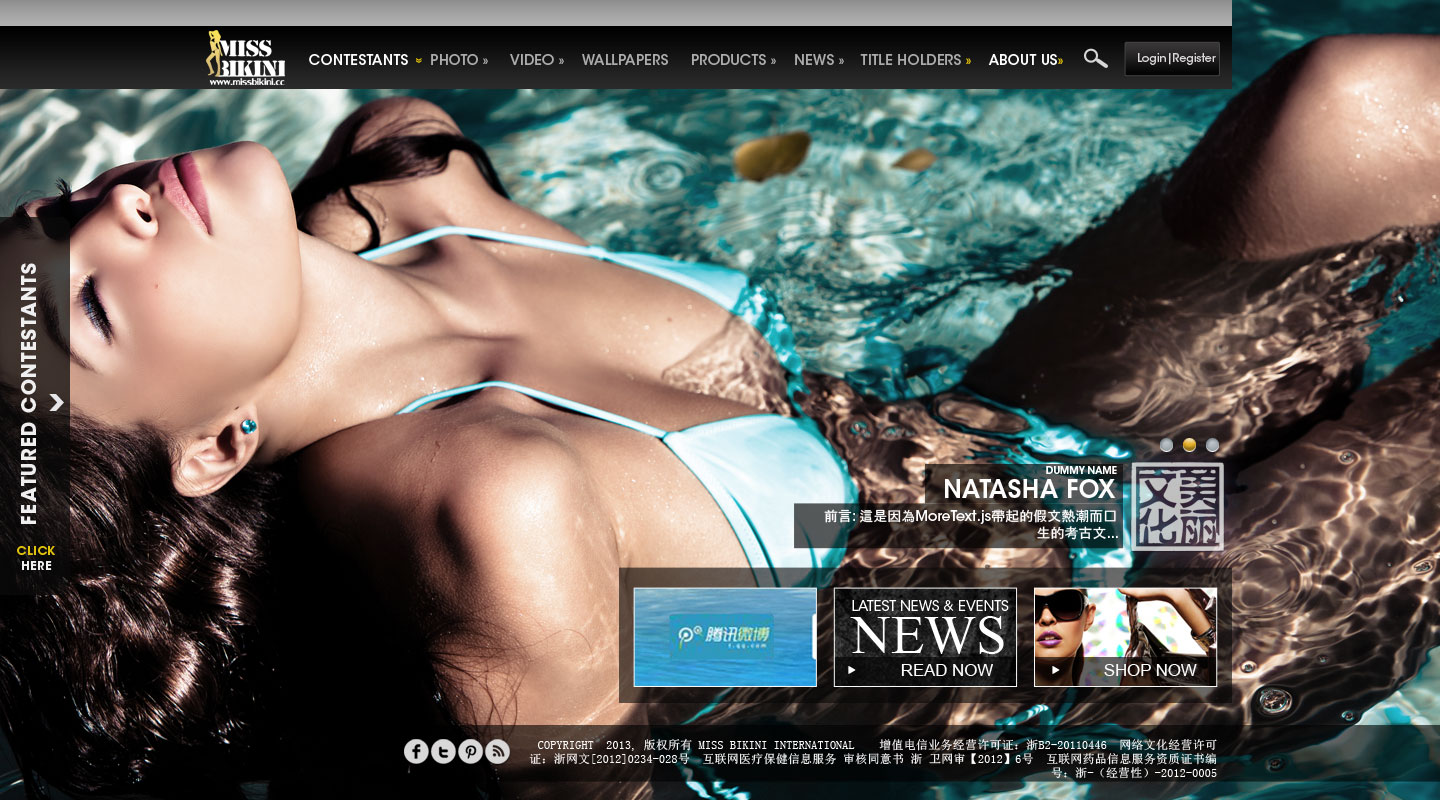
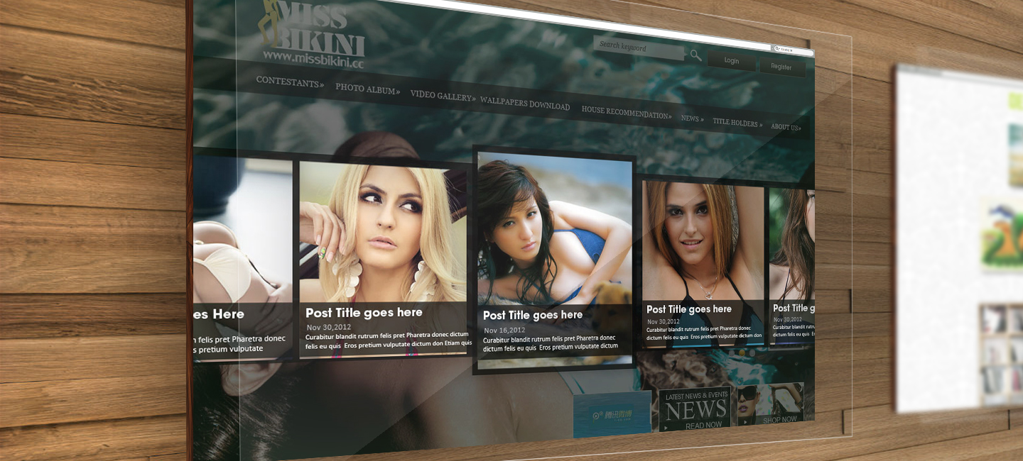
Miss Bikini
Overview
Scope of work
Project
Overview
Scope of work
Project
Overview
Scope of work
Project
Overview
Scope of work
.jpg)
Project
Overview
Scope of work
Project
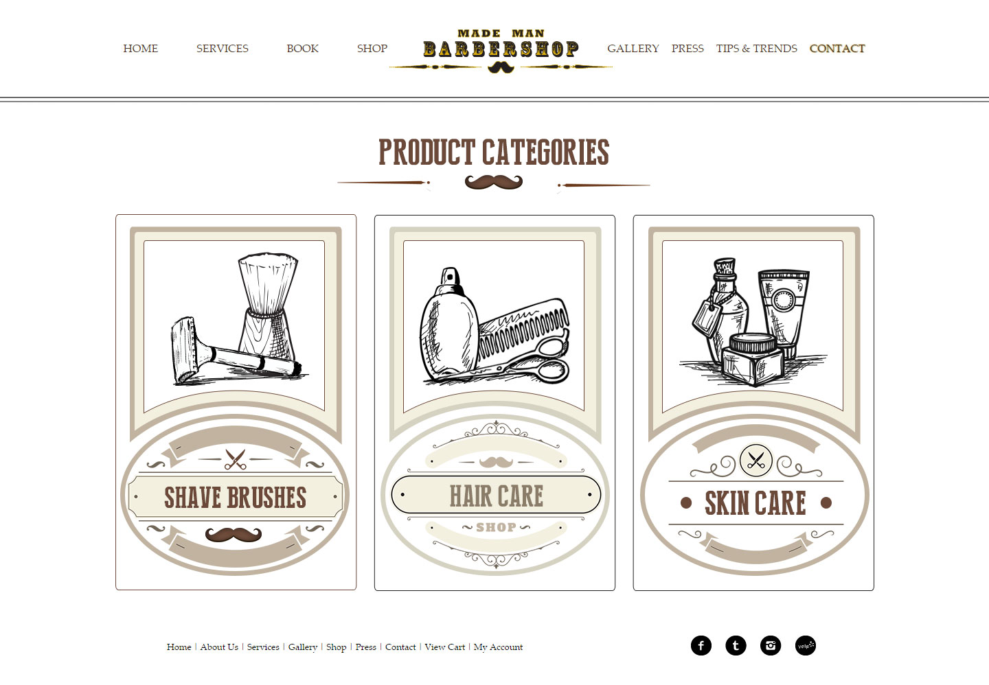
Made Man Barbershop
Overview
Scope of work
Project
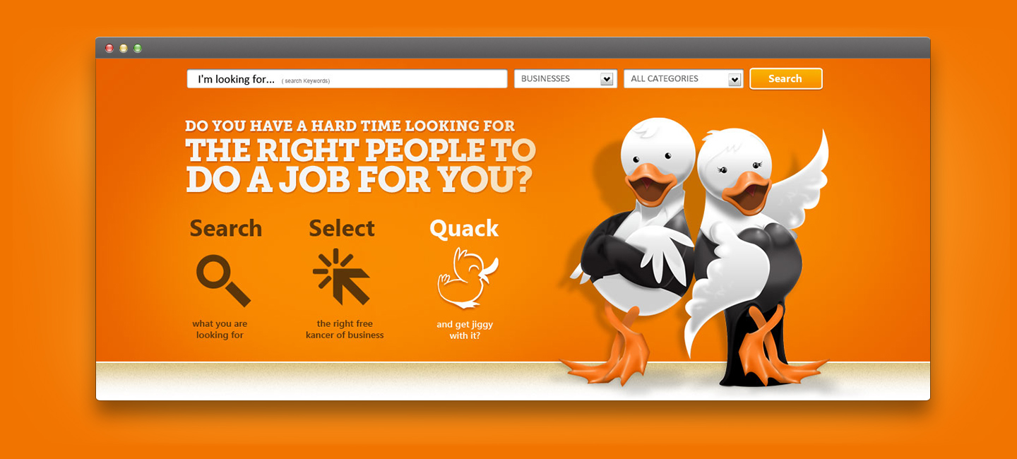
Quack
Overview
Scope of work
Project
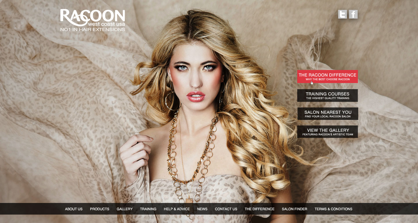
Racoon west coast usa
Overview
Scope of work
Project
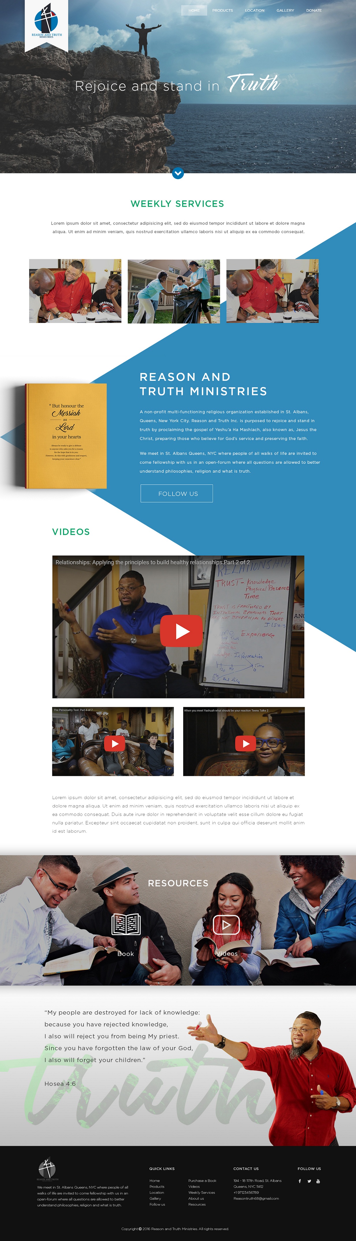
Reason and Truth
Overview
Scope of work
Project
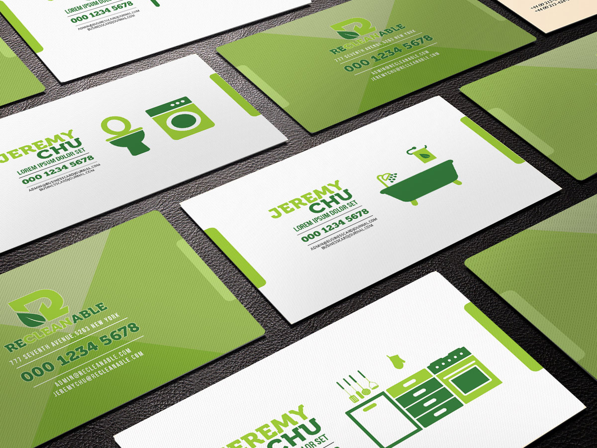
Recleanble Business
Overview
Scope of work
Project
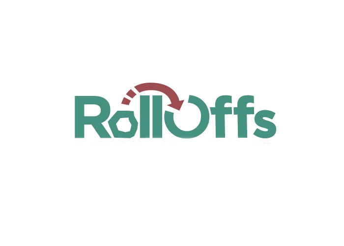
Roll Off
Overview
Scope of work
Project
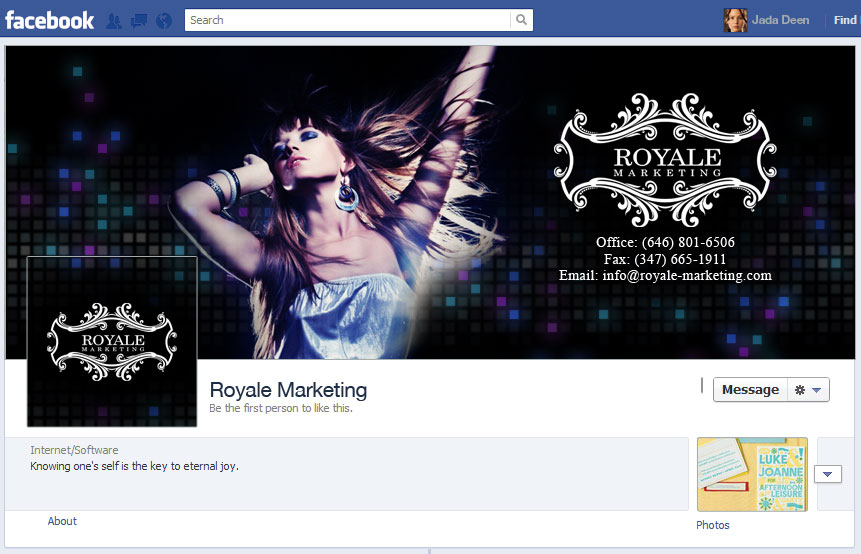
Royale Marketing
Overview
Scope of work
Project
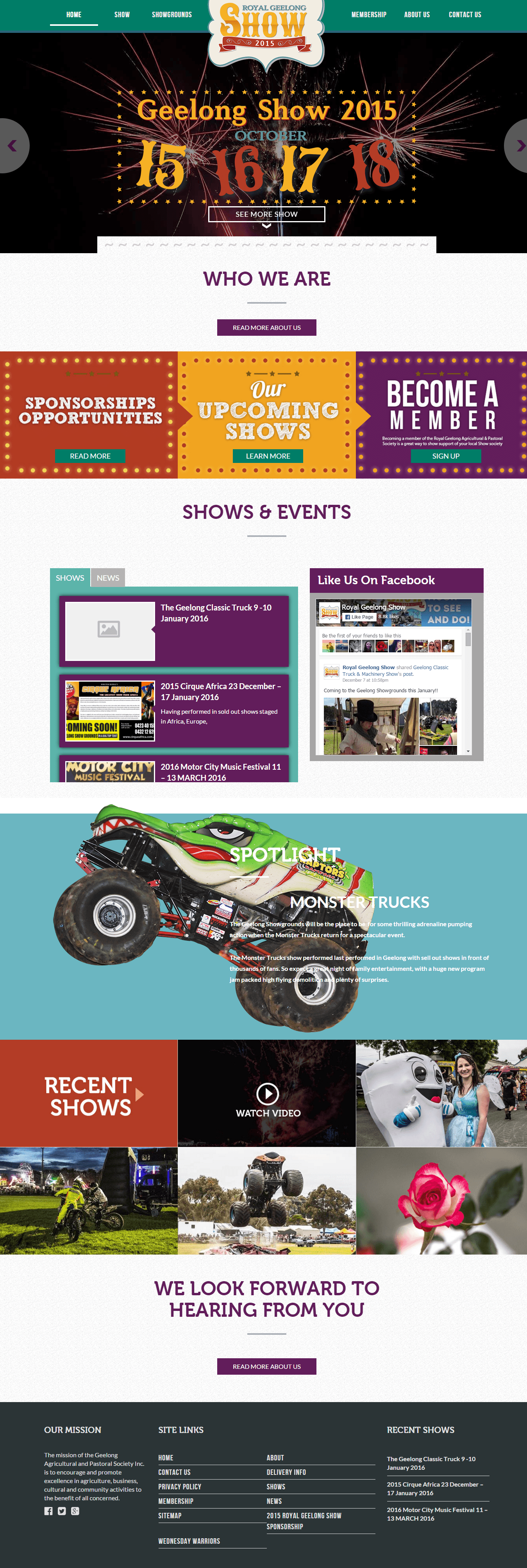
Royal Geelong Show
Overview
Scope of work
Project
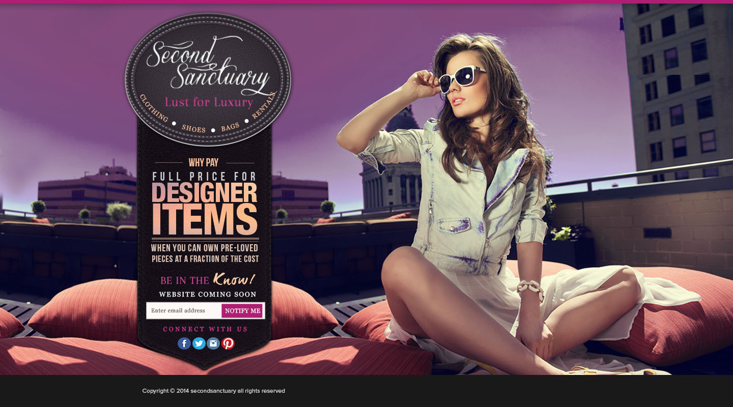
Second Sanctuary
Overview
Scope of work
Project
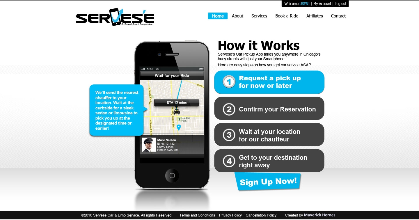
Serves'e
Overview
Scope of work
Project
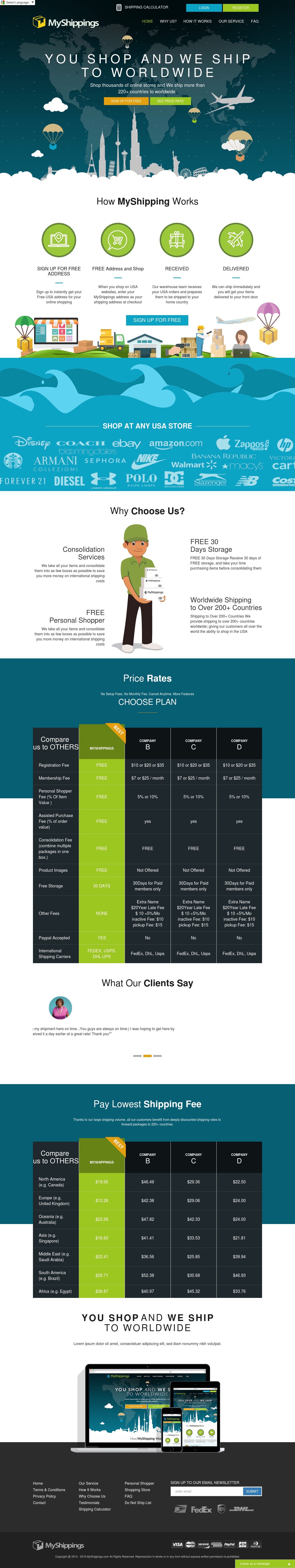
My Shippings
Overview
Scope of work
Project
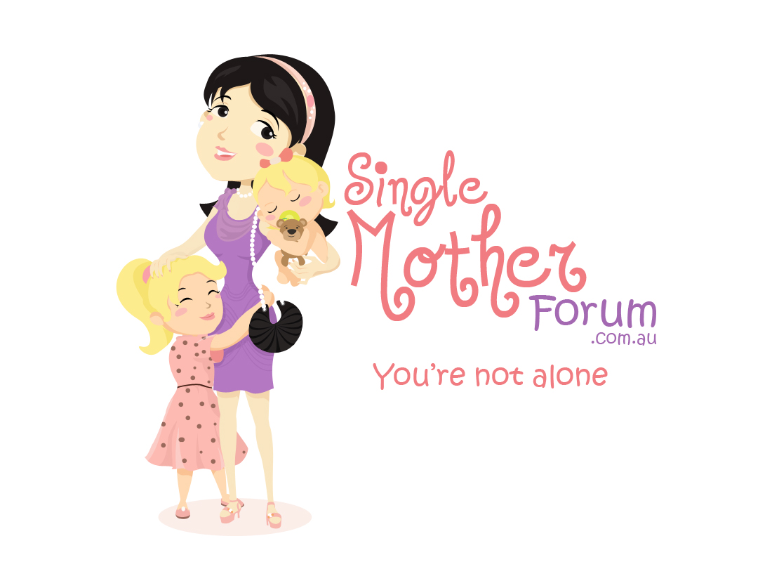
Single Mother Forum
Overview
Scope of work
Project
Overview
Scope of work
Project
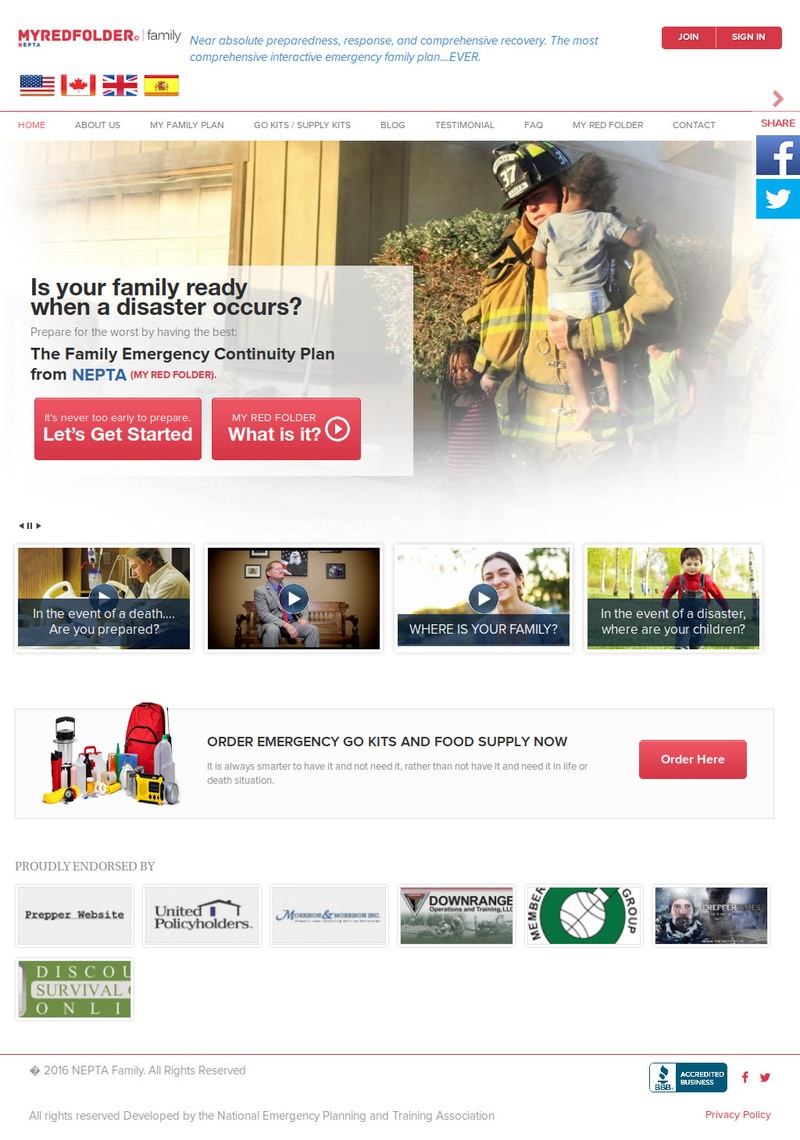
My Red Folder
Overview
Scope of work
Project
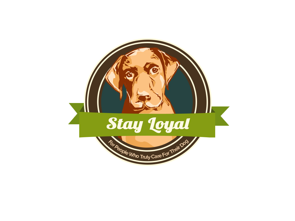
Stay Loyal
Overview
Scope of work
Project
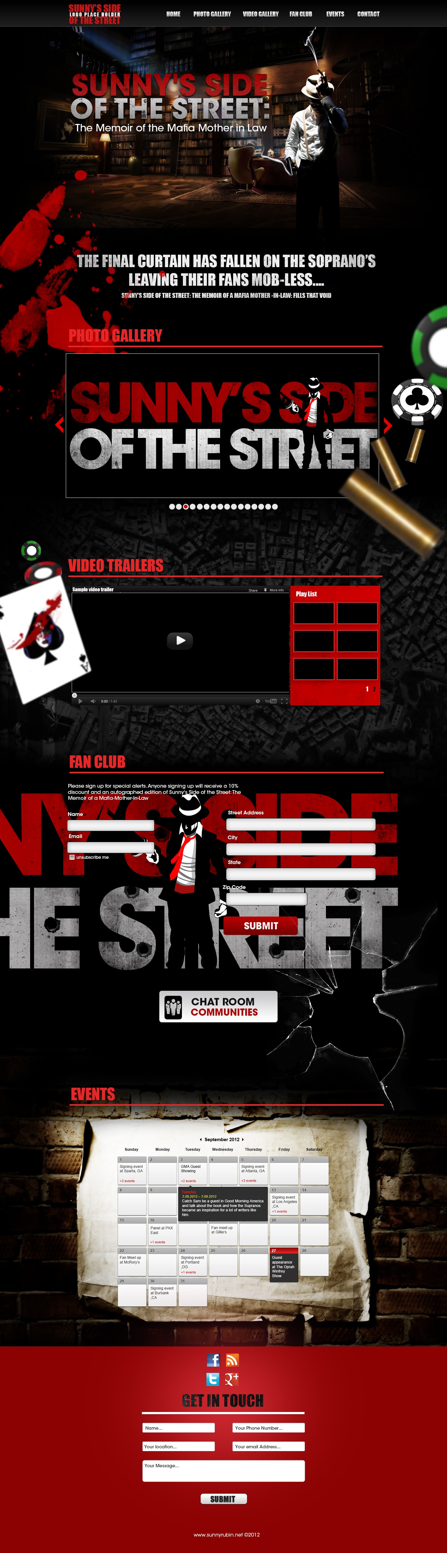
Sunny Rubin
Overview
Scope of work
Project
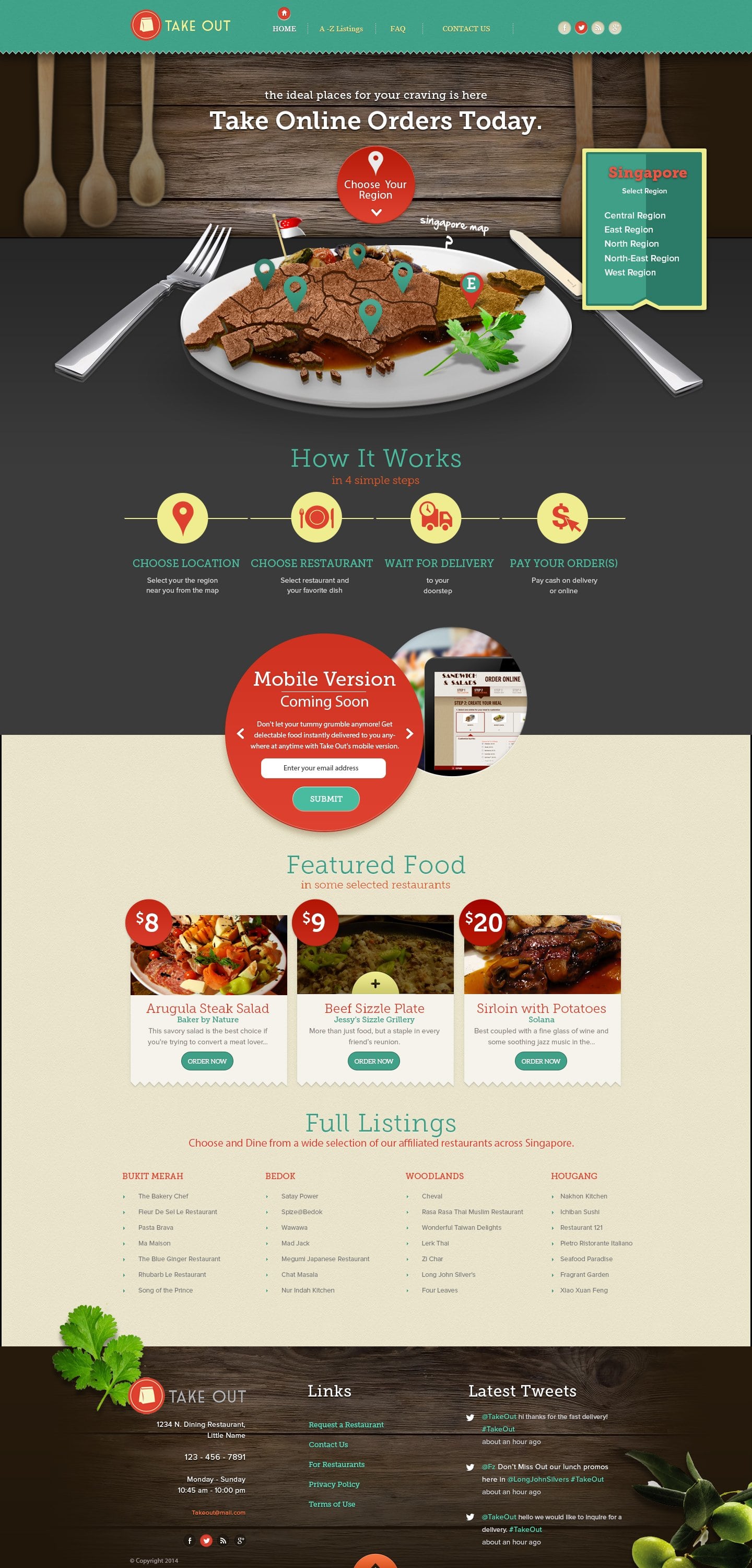
Take Out
Overview
Scope of work
Project
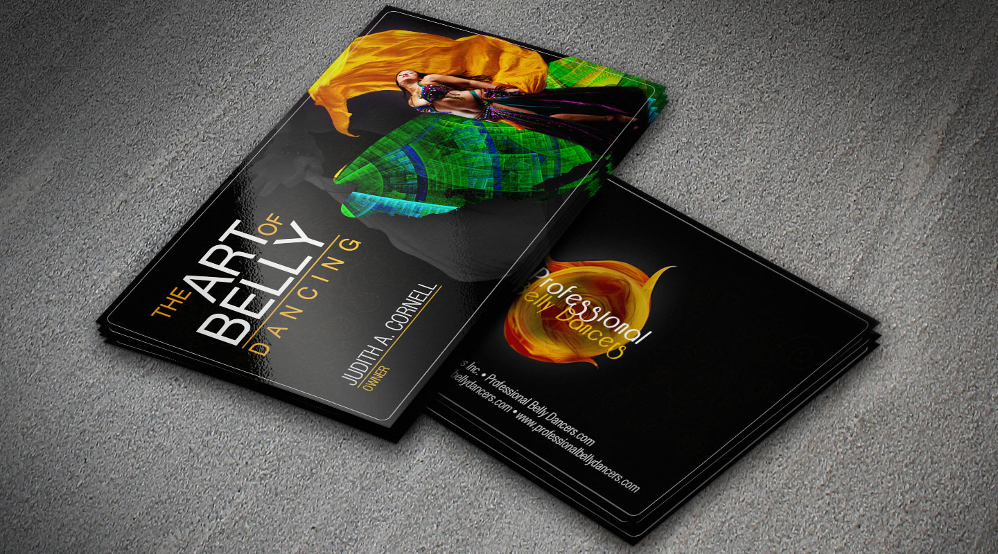
The Art of Belly dancing Business card
Overview
Scope of work
Project
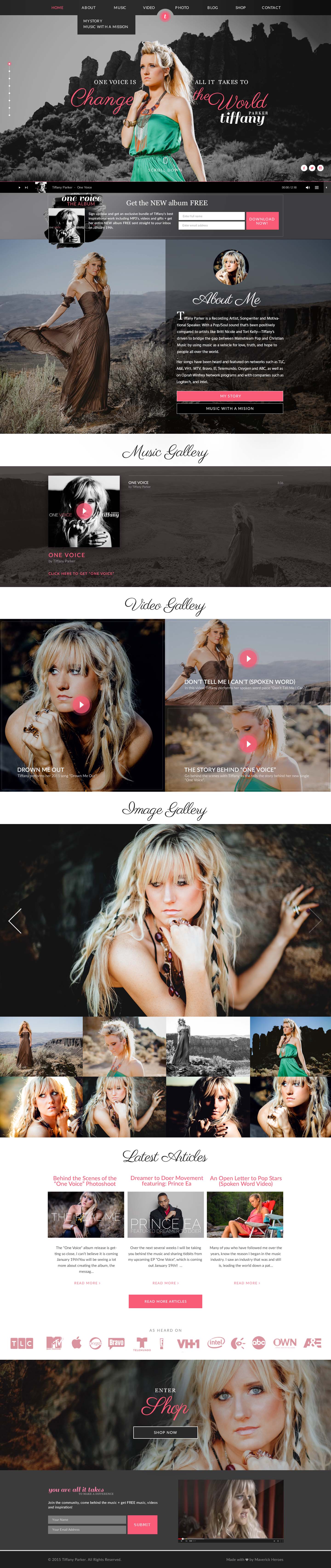
Tiffany parker
Overview
Scope of work

Project
Travel Bird
Overview
Scope of work
Project
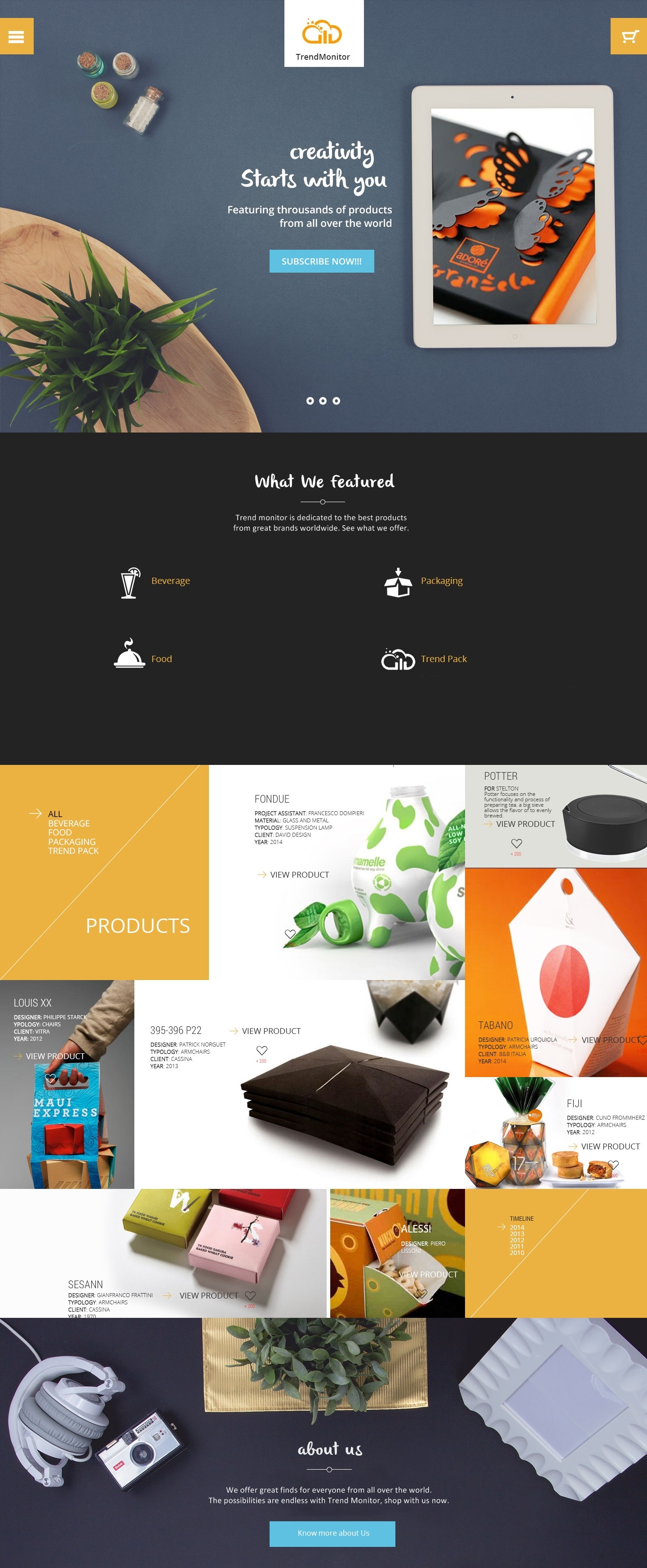
Trend Monitor
Overview
Scope of work
Project
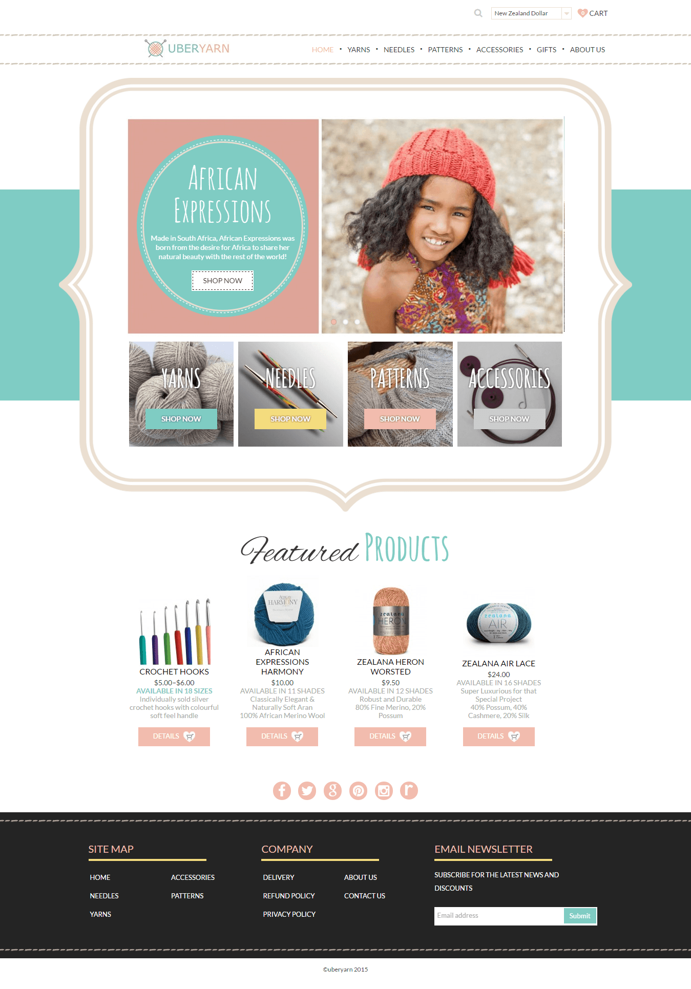
Ube yarn
Overview
Scope of work
Project
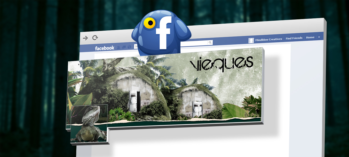
Vieques
Overview
Scope of work
Project
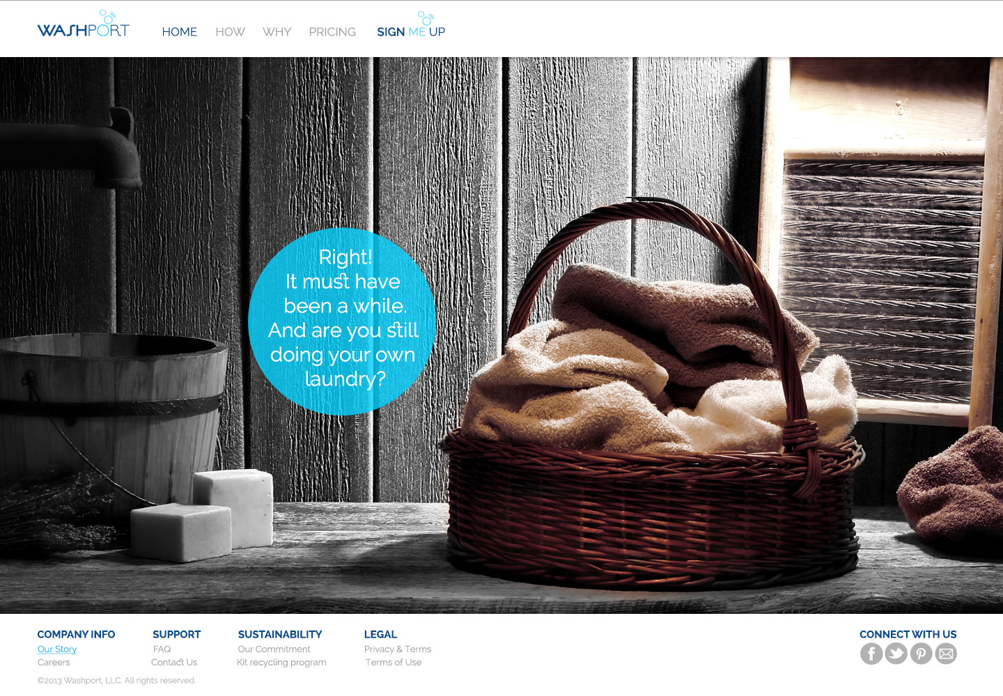
Washport
Overview
Scope of work
.jpg)
Project
Wendy Leask
Overview
Scope of work
Project
Whakki Media
Overview
Scope of work
Project
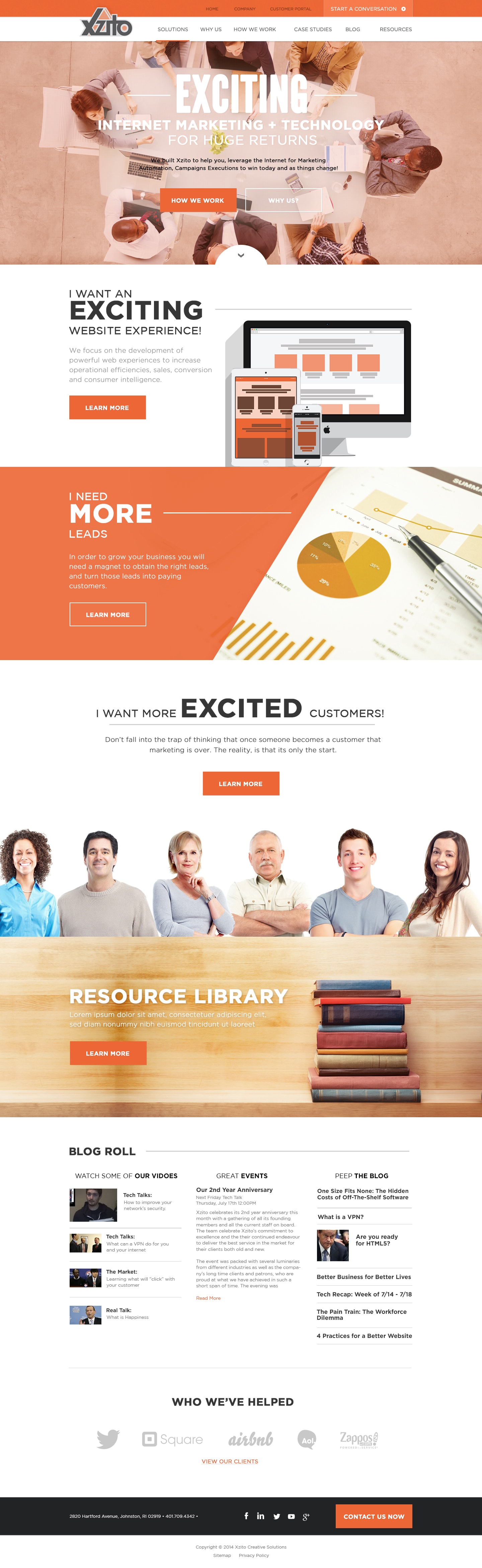
Xzito
Overview
Scope of work